Media guests
An open container — a card, a bento cell, a feature — adapts its slot to whatever rune you drop in, name-agnostically; the guest just fills it. There's no per-guest CSS and no bespoke "chart card" or "map card" rune — a designed tile is a plain container fed a guest.
The container's leading zone (before the first ---) is its media zone, and the media-zone contract sizes, clips, and centres any guest that lands there. This page catalogues the patterns. For how the contract works — the open-world model, when a guest opts out of the clip, the interaction-posture rule — see the Composability contract. To decorate the surface around the guest (frame, cover, tint, gradient), see Surfaces.
Visual data guests
A chart, diagram, or map needs no wrapper — the slot sizes it; a title sits below the ---, or overlays it in a cover poster.
Metric card
A {% chart %} fills the media well; the same plain card, only the guest changed.
{% card %}
{% chart type="bar" %}
| Quarter | Revenue |
|---------|---------|
| Q1 | 4200 |
| Q2 | 5100 |
| Q3 | 4800 |
| Q4 | 6200 |
{% /chart %}

---

### Quarterly revenue
Up 14% on the year.
{% /card %}<div data-rune="card" data-rune-fields="{"media-position":"top"}">
<div data-section="media" data-name="media">
<rf-chart data-rune="chart" data-rune-fields="{"type":"bar","stacked":"false"}">
<table data-name="data">
<thead>
<tr>
<th>Quarter</th>
<th>Revenue</th>
</tr>
</thead>
<tbody>
<tr>
<td>Q1</td>
<td>4200</td>
</tr>
<tr>
<td>Q2</td>
<td>5100</td>
</tr>
<tr>
<td>Q3</td>
<td>4800</td>
</tr>
<tr>
<td>Q4</td>
<td>6200</td>
</tr>
</tbody>
</table>
</rf-chart>
</div>
<div data-name="body">
<h3 id="quarterly-revenue" data-name="title">Quarterly revenue</h3>
<p>Up 14% on the year.</p>
</div>
</div>| Quarter | Revenue |
|---|---|
| Q1 | 4200 |
| Q2 | 5100 |
| Q3 | 4800 |
| Q4 | 6200 |
Quarterly revenue
Up 14% on the year.
<div class="rf-card" data-media-position="top" data-rune="card" data-density="full">
  <div data-section="media" data-name="media" class="rf-card__media">
    <rf-chart class="rf-chart" data-type="bar" data-stacked="false" data-rune="chart" data-density="compact">
      <table data-name="data" class="rf-chart__data">
        <thead>
          <tr>
            <th>Quarter</th>
            <th>Revenue</th>
          </tr>
        </thead>
        <tbody>
          <tr>
            <td>Q1</td>
            <td>4200</td>
          </tr>
          <tr>
            <td>Q2</td>
            <td>5100</td>
          </tr>
          <tr>
            <td>Q3</td>
            <td>4800</td>
          </tr>
          <tr>
            <td>Q4</td>
            <td>6200</td>
          </tr>
        </tbody>
      </table>
    </rf-chart>
  </div>
  <div data-name="content" class="rf-card__content">
    <div data-name="body" class="rf-card__body">
      <h3 id="quarterly-revenue" data-name="title" class="rf-card__title">Quarterly revenue</h3>
      <p>Up 14% on the year.</p>
    </div>
  </div>
</div>
Drop the same chart into a bento cell and you get a dashboard grid — same guest, different container.
Architecture card
A {% diagram %} renders to inline SVG, then the slot sizes it. It's non-interactive, so it composes the same whether or not the card links.
{% card %}
{% diagram language="mermaid" %}
```mermaid
graph LR
  A[Content] --> B[Transform]
  B --> C[Render]
  C --> D[HTML]
```
{% /diagram %}

---

### Pipeline at a glance
Four stages, content to output.
{% /card %}<div data-rune="card" data-rune-fields="{"media-position":"top"}">
<div data-section="media" data-name="media">
<rf-diagram data-rune="diagram" data-rune-fields="{"language":"mermaid"}">
<div data-name="container">
<pre data-name="source">
<code>graph LR
A[Content] --> B[Transform]
B --> C[Render]
C --> D[HTML]
</code>
</pre>
</div>
<template data-content="source">graph LR
A[Content] --> B[Transform]
B --> C[Render]
C --> D[HTML]
</template>
</rf-diagram>
</div>
<div data-name="body">
<h3 id="pipeline-at-a-glance" data-name="title">Pipeline at a glance</h3>
<p>Four stages, content to output.</p>
</div>
</div>graph LR
A[Content] --> B[Transform]
B --> C[Render]
C --> D[HTML]
Pipeline at a glance
Four stages, content to output.
<div class="rf-card" data-media-position="top" data-rune="card" data-density="full">
<div data-section="media" data-name="media" class="rf-card__media">
<rf-diagram class="rf-diagram" data-language="mermaid" data-rune="diagram" data-density="compact">
<div data-name="container" class="rf-diagram__container">
<pre data-name="source" class="rf-diagram__source"><code>graph LR
A[Content] --> B[Transform]
B --> C[Render]
C --> D[HTML]
</code></pre>
</div>
<template data-content="source">graph LR
A[Content] --> B[Transform]
B --> C[Render]
C --> D[HTML]
</template>
</rf-diagram>
</div>
<div data-name="content" class="rf-card__content">
<div data-name="body" class="rf-card__body">
<h3 id="pipeline-at-a-glance" data-name="title" class="rf-card__title">Pipeline at a glance</h3>
<p>Four stages, content to output.</p>
</div>
</div>
</div>Location card
A {% map %} as a cover poster: it fills the card and a title overlays it. This card is a linked cover, so the map is an inert backdrop — the whole poster is one click target (see Interactive guests & posture, below). Drop the same map into a plain card and it pans and zooms.
{% card href="/runes/places/map" media-position="cover" height="md" %}
{% map zoom="12" center="48.8566, 2.3522" %}
- **Paris** - *Demoted to a backdrop* - 48.8566, 2.3522
{% /map %}

---

### A linked location poster
The map would normally pan and zoom; inside a linked cover card its controls go silent, so the whole surface stays a single click target.
{% /card %}<div data-rune="card" data-rune-fields="{"media-position":"cover","height":"md"}">
<div data-section="media" data-name="media">
<rf-map data-rune="map" typeof="Place" data-rune-fields="{"zoom":"12","center":"48.8566, 2.3522","variant":"street","height":"medium","provider":"openstreetmap","interactive":"true","route":"false","cluster":"false"}">
<ol data-name="pins">
<li data-field="pin" data-rune="map-pin" data-rune-fields="{"lat":"48.8566","lng":"2.3522","address":"","url":"","group":""}">
<span data-name="name">Paris</span>
<span data-name="description">Demoted to a backdrop</span>
</li>
</ol>
</rf-map>
</div>
<div data-name="body">
<h3 id="a-linked-location-poster" data-name="title">A linked location poster</h3>
<p>The map would normally pan and zoom; inside a linked cover card its controls go silent, so the whole surface stays a single click target.</p>
</div>
<a data-name="link" href="/runes/places/map" aria-hidden="true" tabindex="-1"></a>
</div>- ParisDemoted to a backdrop
A linked location poster
The map would normally pan and zoom; inside a linked cover card its controls go silent, so the whole surface stays a single click target.
<div class="rf-card rf-card--cover" data-media-position="cover" data-height="md" data-rune="card" data-density="full" data-cover-scope="full">
  <div data-section="media" data-name="media" class="rf-card__media" data-guest-posture="presentational">
    <rf-map typeof="Place" class="rf-map rf-map--street rf-map--medium" data-variant="street" data-height="medium" data-zoom="12" data-center="48.8566, 2.3522" data-provider="openstreetmap" data-interactive="true" data-route="false" data-cluster="false" data-rune="map" data-density="compact">
      <div data-name="container" class="rf-map__container">
        <ol data-name="pins" class="rf-map__pins">
          <li data-field="pin" class="rf-map-pin" data-lat="48.8566" data-lng="2.3522" data-address="" data-url="" data-group="" data-rune="map-pin" data-density="full">
            <span data-name="name" class="rf-map-pin__name">Paris</span>
            <span data-name="description" class="rf-map-pin__description">Demoted to a backdrop</span>
          </li>
        </ol>
      </div>
    </rf-map>
  </div>
  <div data-name="content" class="rf-card__content" data-color-scheme="dark">
    <div data-name="body" class="rf-card__body">
      <h3 id="a-linked-location-poster" data-name="title" class="rf-card__title">A linked location poster</h3>
      <p>The map would normally pan and zoom; inside a linked cover card its controls go silent, so the whole surface stays a single click target.</p>
    </div>
  </div>
  <a data-name="link" href="/runes/places/map" aria-hidden="true" tabindex="-1" class="rf-card__link"></a>
</div>
Dashboard grid
The same chart guest, repeated across {% bento-cell %}s. A bento cell adopts card's zone contract — content splits on --- into media / body / footer — so a chart in the leading zone is a media guest exactly as in the metric card. Uniform row tracks keep the tiles aligned.
{% bento columns=6 %}

{% bento-cell %}
{% chart type="bar" %}
| Month | Revenue |
|-------|---------|
| Jan | 4200 |
| Feb | 5100 |
| Mar | 4800 |
| Apr | 6200 |
{% /chart %}

---

### Revenue
Up 14% on the quarter.
{% /bento-cell %}

{% bento-cell %}
{% chart type="line" %}
| Week | Signups |
|------|---------|
| W1 | 120 |
| W2 | 180 |
| W3 | 240 |
| W4 | 360 |
{% /chart %}

---

### Signups
Trending up week over week.
{% /bento-cell %}

{% /bento %}<section data-rune="bento" data-rune-fields="{"gap":"1rem","columns":"6","row-height":"","content-height":"","media-ratio":"","collapse":""}">
<div data-name="grid">
<div data-field="cell" data-rune="bento-cell" data-rune-fields="{"size":"medium","cols":"3","rows":"1","content-height":"","media-ratio":""}" data-media-position="top">
<div data-section="media" data-name="media">
<rf-chart data-rune="chart" data-rune-fields="{"type":"bar","stacked":"false"}">
<table data-name="data">
<thead>
<tr>
<th>Month</th>
<th>Revenue</th>
</tr>
</thead>
<tbody>
<tr>
<td>Jan</td>
<td>4200</td>
</tr>
<tr>
<td>Feb</td>
<td>5100</td>
</tr>
<tr>
<td>Mar</td>
<td>4800</td>
</tr>
<tr>
<td>Apr</td>
<td>6200</td>
</tr>
</tbody>
</table>
</rf-chart>
</div>
<div data-name="body">
<h3 id="revenue">Revenue</h3>
<p>Up 14% on the quarter.</p>
</div>
</div>
<div data-field="cell" data-rune="bento-cell" data-rune-fields="{"size":"medium","cols":"3","rows":"1","content-height":"","media-ratio":""}" data-media-position="top">
<div data-section="media" data-name="media">
<rf-chart data-rune="chart" data-rune-fields="{"type":"line","stacked":"false"}">
<table data-name="data">
<thead>
<tr>
<th>Week</th>
<th>Signups</th>
</tr>
</thead>
<tbody>
<tr>
<td>W1</td>
<td>120</td>
</tr>
<tr>
<td>W2</td>
<td>180</td>
</tr>
<tr>
<td>W3</td>
<td>240</td>
</tr>
<tr>
<td>W4</td>
<td>360</td>
</tr>
</tbody>
</table>
</rf-chart>
</div>
<div data-name="body">
<h3 id="signups">Signups</h3>
<p>Trending up week over week.</p>
</div>
</div>
</div>
</section>| Month | Revenue |
|---|---|
| Jan | 4200 |
| Feb | 5100 |
| Mar | 4800 |
| Apr | 6200 |
Revenue
Up 14% on the quarter.
| Week | Signups |
|---|---|
| W1 | 120 |
| W2 | 180 |
| W3 | 240 |
| W4 | 360 |
Signups
Trending up week over week.
<section class="rf-bento" data-columns="6" data-gap="1rem" data-row-height="" data-content-height="" data-media-ratio="" data-collapse="" data-rune="bento" data-density="full" style="--bento-columns: 6; --bento-gap: 1rem">
  <div data-name="grid" class="rf-bento__grid">
    <div data-field="cell" class="rf-bento-cell" data-media-position="top" data-size="medium" data-cols="3" data-rows="1" data-content-height="" data-media-ratio="" data-rune="bento-cell" data-density="compact" style="--cell-cols: 3; --cell-rows: 1">
      <div data-section="media" data-name="media" class="rf-bento-cell__media">
        <rf-chart class="rf-chart" data-type="bar" data-stacked="false" data-rune="chart" data-density="compact">
          <table data-name="data" class="rf-chart__data">
            <thead>
              <tr>
                <th>Month</th>
                <th>Revenue</th>
              </tr>
            </thead>
            <tbody>
              <tr>
                <td>Jan</td>
                <td>4200</td>
              </tr>
              <tr>
                <td>Feb</td>
                <td>5100</td>
              </tr>
              <tr>
                <td>Mar</td>
                <td>4800</td>
              </tr>
              <tr>
                <td>Apr</td>
                <td>6200</td>
              </tr>
            </tbody>
          </table>
        </rf-chart>
      </div>
      <div data-name="content" class="rf-bento-cell__content">
        <div data-name="body" class="rf-bento-cell__body">
          <h3 id="revenue">Revenue</h3>
          <p>Up 14% on the quarter.</p>
        </div>
      </div>
    </div>
    <div data-field="cell" class="rf-bento-cell" data-media-position="top" data-size="medium" data-cols="3" data-rows="1" data-content-height="" data-media-ratio="" data-rune="bento-cell" data-density="compact" style="--cell-cols: 3; --cell-rows: 1">
      <div data-section="media" data-name="media" class="rf-bento-cell__media">
        <rf-chart class="rf-chart" data-type="line" data-stacked="false" data-rune="chart" data-density="compact">
          <table data-name="data" class="rf-chart__data">
            <thead>
              <tr>
                <th>Week</th>
                <th>Signups</th>
              </tr>
            </thead>
            <tbody>
              <tr>
                <td>W1</td>
                <td>120</td>
              </tr>
              <tr>
                <td>W2</td>
                <td>180</td>
              </tr>
              <tr>
                <td>W3</td>
                <td>240</td>
              </tr>
              <tr>
                <td>W4</td>
                <td>360</td>
              </tr>
            </tbody>
          </table>
        </rf-chart>
      </div>
      <div data-name="content" class="rf-bento-cell__content">
        <div data-name="body" class="rf-bento-cell__body">
          <h3 id="signups">Signups</h3>
          <p>Trending up week over week.</p>
        </div>
      </div>
    </div>
  </div>
</section>
Code & comparison
Code-sample card
A {% codegroup %} in the media zone is a tabbed snippet with a title below — here dressed with a displaced frame over a substrate fill (the chrome itself is documented in Surfaces). With no href the tabs stay interactive.
{% card frame-aspect="3/2" frame-displace="bottom-end" frame-offset="md" frame-oversize="1.15" substrate="cross" substrate-target="media" %}
{% codegroup title="refrakt.config.ts" %}
```ts
import { defineConfig } from '@refrakt-md/cli';
import marketing from '@refrakt-md/marketing';
import learning from '@refrakt-md/learning';
import storytelling from '@refrakt-md/storytelling';

export default defineConfig({
  content: './content',
  theme: '@refrakt-md/lumina',
  plugins: [
    marketing(),
    learning(),
    storytelling(),
  ],
  surfaces: {
    card: {
      elevation: 'md',
      frame: { aspect: '16/9' },
    },
    figure: {
      frame: { shadow: 'lg', anchor: 'top' },
    },
  },
});
```
{% /codegroup %}

---

### Codegroup over a substrate
The codegroup oversizes and displaces toward the bottom-right; the cross substrate fills the media slot beneath and shows through the strip the codegroup no longer covers.
{% /card %}<div data-rune="card" data-rune-fields="{"media-position":"top"}">
<div data-section="media" data-name="media">
<section data-rune="code-group" data-rune-fields="{"title":"refrakt.config.ts"}">
<div class="rf-codeblock">
<pre data-language="ts">
<code data-language="ts">import { defineConfig } from '@refrakt-md/cli';
import marketing from '@refrakt-md/marketing';
import learning from '@refrakt-md/learning';
import storytelling from '@refrakt-md/storytelling';
export default defineConfig({
content: './content',
theme: '@refrakt-md/lumina',
plugins: [
marketing(),
learning(),
storytelling(),
],
surfaces: {
card: {
elevation: 'md',
frame: { aspect: '16/9' },
},
figure: {
frame: { shadow: 'lg', anchor: 'top' },
},
},
});
</code>
</pre>
</div>
</section>
</div>
<div data-name="body">
<h3 id="codegroup-over-a-substrate" data-name="title">Codegroup over a substrate</h3>
<p>The codegroup oversizes and displaces toward the bottom-right; the cross substrate fills the media slot beneath and shows through the strip the codegroup no longer covers.</p>
</div>
<meta data-field="frame-aspect" content="3/2">
<meta data-field="frame-displace" content="bottom-end">
<meta data-field="frame-offset" content="md">
<meta data-field="frame-oversize" content="1.15">
<meta data-field="substrate" content="cross">
<meta data-field="substrate-target" content="media">
</div>import { defineConfig } from '@refrakt-md/cli';
import marketing from '@refrakt-md/marketing';
import learning from '@refrakt-md/learning';
import storytelling from '@refrakt-md/storytelling';
export default defineConfig({
content: './content',
theme: '@refrakt-md/lumina',
plugins: [
marketing(),
learning(),
storytelling(),
],
surfaces: {
card: {
elevation: 'md',
frame: { aspect: '16/9' },
},
figure: {
frame: { shadow: 'lg', anchor: 'top' },
},
},
});
Codegroup over a substrate
The codegroup oversizes and displaces toward the bottom-right; the cross substrate fills the media slot beneath and shows through the strip the codegroup no longer covers.
<div class="rf-card" data-media-position="top" data-rune="card" data-density="full">
  <div data-section="media" data-name="media" class="rf-card__media" data-displace="bottom-end" style="--frame-aspect: 3/2; --frame-offset: var(--rf-spacing-md); --frame-oversize: 1.15" data-substrate="cross">
    <section class="rf-codegroup rf-codegroup--scroll" data-title="refrakt.config.ts" data-overflow="scroll" data-rune="code-group" data-density="compact" data-code-host="true">
      <div data-name="topbar" data-zone="topbar" data-zone-layout="bar" class="rf-codegroup__topbar" data-section="header">
        <span data-meta-type="code">refrakt.config.ts</span>
      </div>
      <div class="rf-codeblock">
        <pre data-language="ts"><code data-language="ts">import { defineConfig } from '@refrakt-md/cli';
import marketing from '@refrakt-md/marketing';
import learning from '@refrakt-md/learning';
import storytelling from '@refrakt-md/storytelling';

export default defineConfig({
  content: './content',
  theme: '@refrakt-md/lumina',
  plugins: [
    marketing(),
    learning(),
    storytelling(),
  ],
  surfaces: {
    card: {
      elevation: 'md',
      frame: { aspect: '16/9' },
    },
    figure: {
      frame: { shadow: 'lg', anchor: 'top' },
    },
  },
});
</code></pre>
      </div>
    </section>
  </div>
  <div data-name="content" class="rf-card__content">
    <div data-name="body" class="rf-card__body">
      <h3 id="codegroup-over-a-substrate" data-name="title" class="rf-card__title">Codegroup over a substrate</h3>
      <p>The codegroup oversizes and displaces toward the bottom-right; the cross substrate fills the media slot beneath and shows through the strip the codegroup no longer covers.</p>
    </div>
  </div>
</div>
Comparison card
A {% juxtapose %} is a draggable before/after; the two panels are its --- split and hold anything — two images for a photo comparison, or two sandboxes with opposite tint-mode for a live light/dark view.
{% card %}
{% juxtapose labels="Summer, Winter" %}

---
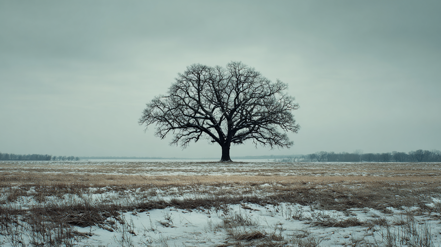
{% /juxtapose %}
---
### Same tree, two seasons
Drag the divider to flip between July and February.
{% /card %}<div data-rune="card" data-rune-fields="{"media-position":"top"}">
<div data-section="media" data-name="media">
<section data-rune="juxtapose" data-rune-fields="{"variant":"slider","orientation":"vertical","position":"50","duration":"1000"}">
<div data-name="panels">
<div data-field="panel" data-rune="juxtapose-panel">
<span data-name="name">Summer</span>
<div data-name="body">
<img src="https://assets.refrakt.md/oak-tree-summer.png" alt="Oak tree summer">
</div>
</div>
<div data-field="panel" data-rune="juxtapose-panel">
<span data-name="name">Winter</span>
<div data-name="body">
<img src="https://assets.refrakt.md/oak-tree-winter.png" alt="Oak tree winter">
</div>
</div>
</div>
</section>
</div>
<div data-name="body">
<h3 id="same-tree,-two-seasons" data-name="title">Same tree, two seasons</h3>
<p>Drag the divider to flip between July and February.</p>
</div>
</div>

Same tree, two seasons
Drag the divider to flip between July and February.
<div class="rf-card" data-media-position="top" data-rune="card" data-density="full">
  <div data-section="media" data-name="media" class="rf-card__media">
    <section class="rf-juxtapose rf-juxtapose--slider" data-variant="slider" data-orientation="vertical" data-position="50" data-duration="1000" data-rune="juxtapose" data-density="compact" style="--jx-position: 50; --jx-duration: 1000">
      <div data-name="panels" class="rf-juxtapose__panels">
        <div data-field="panel" class="rf-juxtapose-panel" data-rune="juxtapose-panel" data-density="full" data-state="inactive">
          <span data-name="name" class="rf-juxtapose-panel__name">Summer</span>
          <div data-name="body" class="rf-juxtapose-panel__body">
            <img src="https://assets.refrakt.md/oak-tree-summer.png" alt="Oak tree summer" />
          </div>
        </div>
        <div data-field="panel" class="rf-juxtapose-panel" data-rune="juxtapose-panel" data-density="full" data-state="inactive">
          <span data-name="name" class="rf-juxtapose-panel__name">Winter</span>
          <div data-name="body" class="rf-juxtapose-panel__body">
            <img src="https://assets.refrakt.md/oak-tree-winter.png" alt="Oak tree winter" />
          </div>
        </div>
      </div>
    </section>
  </div>
  <div data-name="content" class="rf-card__content">
    <div data-name="body" class="rf-card__body">
      <h3 id="same-tree,-two-seasons" data-name="title" class="rf-card__title">Same tree, two seasons</h3>
      <p>Drag the divider to flip between July and February.</p>
    </div>
  </div>
</div>
{% card %}
{% juxtapose labels="Light, Dark" %}
{% sandbox src="profile-card" framework="tailwind" tint-mode="light" /%}
---
{% sandbox src="profile-card" framework="tailwind" tint-mode="dark" /%}
{% /juxtapose %}
---
### Profile card, both modes
The shared `profile-card` example — left panel pinned to light, right to dark.
{% /card %}<div data-rune="card" data-rune-fields="{"media-position":"top"}">
<div data-section="media" data-name="media">
<section data-rune="juxtapose" data-rune-fields="{"variant":"slider","orientation":"vertical","position":"50","duration":"1000"}">
<div data-name="panels">
<div data-field="panel" data-rune="juxtapose-panel">
<span data-name="name">Light</span>
<div data-name="body">
<rf-sandbox data-rune="sandbox" data-source-content="<div data-source="HTML">
<div class="min-h-screen bg-[#f5f4f1] dark:bg-[#1a1a17] flex items-center justify-center p-6">
<div class="bg-[#fbfaf7] dark:bg-[#211f1c] rounded-2xl shadow-xl max-w-sm w-full overflow-hidden transition-colors">
<!-- Cover Image -->
<div class="h-32 bg-gradient-to-r from-[#e15f80] to-[#c4501c] dark:from-[#e8788f] dark:to-[#e87a3a]"></div>
<!-- Profile Content -->
<div class="relative px-6 pb-6">
<!-- Avatar -->
<div class="flex justify-center -mt-16 mb-4">
<img
src="https://i.pravatar.cc/120?img=32"
alt="Profile"
class="w-32 h-32 rounded-full border-4 border-[#fbfaf7] dark:border-[#211f1c] shadow-lg"
/>
</div>
<!-- User Info -->
<div class="text-center mb-6">
<h2 class="text-2xl font-bold text-[#1c1a17] dark:text-[#f6f4ef] mb-1">Sarah Johnson</h2>
<p class="text-[#6b6661] dark:text-[#94908a] text-sm mb-3">@sarahjohnson</p>
<p class="text-[#1c1a17]/80 dark:text-[#f6f4ef]/80 leading-relaxed">
Product designer passionate about crafting delightful user experiences.
Coffee enthusiast ☕️
</p>
</div>
<!-- Stats -->
<div class="flex justify-around py-4 border-y border-[#e2e0dd] dark:border-[#2a2825] mb-6">
<div class="text-center">
<div class="text-2xl font-bold text-[#1c1a17] dark:text-[#f6f4ef]">1.2k</div>
<div class="text-xs text-[#6b6661] dark:text-[#94908a] uppercase tracking-wide">Followers</div>
</div>
<div class="text-center">
<div class="text-2xl font-bold text-[#1c1a17] dark:text-[#f6f4ef]">842</div>
<div class="text-xs text-[#6b6661] dark:text-[#94908a] uppercase tracking-wide">Following</div>
</div>
<div class="text-center">
<div class="text-2xl font-bold text-[#1c1a17] dark:text-[#f6f4ef]">94</div>
<div class="text-xs text-[#6b6661] dark:text-[#94908a] uppercase tracking-wide">Posts</div>
</div>
</div>
<!-- Action Buttons -->
<div class="flex gap-3">
<button class="flex-1 bg-gradient-to-r from-[#e15f80] to-[#c84a6c] dark:from-[#e8788f] dark:to-[#ef91a3] text-white font-semibold py-3 rounded-xl hover:from-[#c84a6c] hover:to-[#b35070] dark:hover:from-[#ef91a3] dark:hover:to-[#e89db0] transition-all shadow-lg shadow-[#e15f80]/30 dark:shadow-[#e8788f]/20">
Follow
</button>
<button class="flex-1 border-2 border-[#e2e0dd] dark:border-[#2a2825] text-[#1c1a17] dark:text-[#f6f4ef] font-semibold py-3 rounded-xl hover:bg-[#ecebe8] dark:hover:bg-[#2a2825] transition-all">
Message
</button>
</div>
<!-- Social Links -->
<div class="flex justify-center gap-4 mt-6">
<a href="#" class="w-10 h-10 flex items-center justify-center rounded-full bg-[#ecebe8] dark:bg-[#2a2825] text-[#6b6661] dark:text-[#94908a] hover:bg-[#e15f80]/20 dark:hover:bg-[#e8788f]/20 hover:text-[#e15f80] dark:hover:text-[#e8788f] transition-all">
<svg class="w-5 h-5" fill="currentColor" viewBox="0 0 24 24"><path d="M22 12c0-5.523-4.477-10-10-10S2 6.477 2 12c0 4.991 3.657 9.128 8.438 9.878v-6.987h-2.54V12h2.54V9.797c0-2.506 1.492-3.89 3.777-3.89 1.094 0 2.238.195 2.238.195v2.46h-1.26c-1.243 0-1.63.771-1.63 1.562V12h2.773l-.443 2.89h-2.33v6.988C18.343 21.128 22 16.991 22 12z"/></svg>
</a>
<a href="#" class="w-10 h-10 flex items-center justify-center rounded-full bg-[#ecebe8] dark:bg-[#2a2825] text-[#6b6661] dark:text-[#94908a] hover:bg-[#e15f80]/20 dark:hover:bg-[#e8788f]/20 hover:text-[#e15f80] dark:hover:text-[#e8788f] transition-all">
<svg class="w-5 h-5" fill="currentColor" viewBox="0 0 24 24"><path d="M8.29 20.251c7.547 0 11.675-6.253 11.675-11.675 0-.178 0-.355-.012-.53A8.348 8.348 0 0022 5.92a8.19 8.19 0 01-2.357.646 4.118 4.118 0 001.804-2.27 8.224 8.224 0 01-2.605.996 4.107 4.107 0 00-6.993 3.743 11.65 11.65 0 01-8.457-4.287 4.106 4.106 0 001.27 5.477A4.072 4.072 0 012.8 9.713v.052a4.105 4.105 0 003.292 4.022 4.095 4.095 0 01-1.853.07 4.108 4.108 0 003.834 2.85A8.233 8.233 0 012 18.407a11.616 11.616 0 006.29 1.84"/></svg>
</a>
<a href="#" class="w-10 h-10 flex items-center justify-center rounded-full bg-[#ecebe8] dark:bg-[#2a2825] text-[#6b6661] dark:text-[#94908a] hover:bg-[#e15f80]/20 dark:hover:bg-[#e8788f]/20 hover:text-[#e15f80] dark:hover:text-[#e8788f] transition-all">
<svg class="w-5 h-5" fill="currentColor" viewBox="0 0 24 24"><path d="M12 2.163c3.204 0 3.584.012 4.85.07 3.252.148 4.771 1.691 4.919 4.919.058 1.265.069 1.645.069 4.849 0 3.205-.012 3.584-.069 4.849-.149 3.225-1.664 4.771-4.919 4.919-1.266.058-1.644.07-4.85.07-3.204 0-3.584-.012-4.849-.07-3.26-.149-4.771-1.699-4.919-4.92-.058-1.265-.07-1.644-.07-4.849 0-3.204.013-3.583.07-4.849.149-3.227 1.664-4.771 4.919-4.919 1.266-.057 1.645-.069 4.849-.069zm0-2.163c-3.259 0-3.667.014-4.947.072-4.358.2-6.78 2.618-6.98 6.98-.059 1.281-.073 1.689-.073 4.948 0 3.259.014 3.668.072 4.948.2 4.358 2.618 6.78 6.98 6.98 1.281.058 1.689.072 4.948.072 3.259 0 3.668-.014 4.948-.072 4.354-.2 6.782-2.618 6.979-6.98.059-1.28.073-1.689.073-4.948 0-3.259-.014-3.667-.072-4.947-.196-4.354-2.617-6.78-6.979-6.98-1.281-.059-1.69-.073-4.949-.073zm0 5.838c-3.403 0-6.162 2.759-6.162 6.162s2.759 6.163 6.162 6.163 6.162-2.759 6.162-6.163c0-3.403-2.759-6.162-6.162-6.162zm0 10.162c-2.209 0-4-1.79-4 0-2.209 1.791-4 4-4s4 1.791 4 4c0 2.21-1.791 4-4 4zm6.406-11.845c-.796 0-1.441.645-1.441 1.44s.645 1.44 1.441 1.44c.795 0 1.439-.645 1.439-1.44s-.644-1.44-1.439-1.44z"/></svg>
</a>
</div>
</div>
</div>
</div>
</div>" data-framework="tailwind" data-height="auto" data-source-origins="HTML profile-card/index.html" data-security-mode="trusted" data-allow-js="true">
<template data-content="fallback">
<pre data-language="html">
<code data-language="html"><div data-source="HTML">
<div class="min-h-screen bg-[#f5f4f1] dark:bg-[#1a1a17] flex items-center justify-center p-6">
<div class="bg-[#fbfaf7] dark:bg-[#211f1c] rounded-2xl shadow-xl max-w-sm w-full overflow-hidden transition-colors">
<!-- Cover Image -->
<div class="h-32 bg-gradient-to-r from-[#e15f80] to-[#c4501c] dark:from-[#e8788f] dark:to-[#e87a3a]"></div>
<!-- Profile Content -->
<div class="relative px-6 pb-6">
<!-- Avatar -->
<div class="flex justify-center -mt-16 mb-4">
<img
src="https://i.pravatar.cc/120?img=32"
alt="Profile"
class="w-32 h-32 rounded-full border-4 border-[#fbfaf7] dark:border-[#211f1c] shadow-lg"
/>
</div>
<!-- User Info -->
<div class="text-center mb-6">
<h2 class="text-2xl font-bold text-[#1c1a17] dark:text-[#f6f4ef] mb-1">Sarah Johnson</h2>
<p class="text-[#6b6661] dark:text-[#94908a] text-sm mb-3">@sarahjohnson</p>
<p class="text-[#1c1a17]/80 dark:text-[#f6f4ef]/80 leading-relaxed">
Product designer passionate about crafting delightful user experiences.
Coffee enthusiast ☕️
</p>
</div>
<!-- Stats -->
<div class="flex justify-around py-4 border-y border-[#e2e0dd] dark:border-[#2a2825] mb-6">
<div class="text-center">
<div class="text-2xl font-bold text-[#1c1a17] dark:text-[#f6f4ef]">1.2k</div>
<div class="text-xs text-[#6b6661] dark:text-[#94908a] uppercase tracking-wide">Followers</div>
</div>
<div class="text-center">
<div class="text-2xl font-bold text-[#1c1a17] dark:text-[#f6f4ef]">842</div>
<div class="text-xs text-[#6b6661] dark:text-[#94908a] uppercase tracking-wide">Following</div>
</div>
<div class="text-center">
<div class="text-2xl font-bold text-[#1c1a17] dark:text-[#f6f4ef]">94</div>
<div class="text-xs text-[#6b6661] dark:text-[#94908a] uppercase tracking-wide">Posts</div>
</div>
</div>
<!-- Action Buttons -->
<div class="flex gap-3">
<button class="flex-1 bg-gradient-to-r from-[#e15f80] to-[#c84a6c] dark:from-[#e8788f] dark:to-[#ef91a3] text-white font-semibold py-3 rounded-xl hover:from-[#c84a6c] hover:to-[#b35070] dark:hover:from-[#ef91a3] dark:hover:to-[#e89db0] transition-all shadow-lg shadow-[#e15f80]/30 dark:shadow-[#e8788f]/20">
Follow
</button>
<button class="flex-1 border-2 border-[#e2e0dd] dark:border-[#2a2825] text-[#1c1a17] dark:text-[#f6f4ef] font-semibold py-3 rounded-xl hover:bg-[#ecebe8] dark:hover:bg-[#2a2825] transition-all">
Message
</button>
</div>
<!-- Social Links -->
<div class="flex justify-center gap-4 mt-6">
<a href="#" class="w-10 h-10 flex items-center justify-center rounded-full bg-[#ecebe8] dark:bg-[#2a2825] text-[#6b6661] dark:text-[#94908a] hover:bg-[#e15f80]/20 dark:hover:bg-[#e8788f]/20 hover:text-[#e15f80] dark:hover:text-[#e8788f] transition-all">
<svg class="w-5 h-5" fill="currentColor" viewBox="0 0 24 24"><path d="M22 12c0-5.523-4.477-10-10-10S2 6.477 2 12c0 4.991 3.657 9.128 8.438 9.878v-6.987h-2.54V12h2.54V9.797c0-2.506 1.492-3.89 3.777-3.89 1.094 0 2.238.195 2.238.195v2.46h-1.26c-1.243 0-1.63.771-1.63 1.562V12h2.773l-.443 2.89h-2.33v6.988C18.343 21.128 22 16.991 22 12z"/></svg>
</a>
<a href="#" class="w-10 h-10 flex items-center justify-center rounded-full bg-[#ecebe8] dark:bg-[#2a2825] text-[#6b6661] dark:text-[#94908a] hover:bg-[#e15f80]/20 dark:hover:bg-[#e8788f]/20 hover:text-[#e15f80] dark:hover:text-[#e8788f] transition-all">
<svg class="w-5 h-5" fill="currentColor" viewBox="0 0 24 24"><path d="M8.29 20.251c7.547 0 11.675-6.253 11.675-11.675 0-.178 0-.355-.012-.53A8.348 8.348 0 0022 5.92a8.19 8.19 0 01-2.357.646 4.118 4.118 0 001.804-2.27 8.224 8.224 0 01-2.605.996 4.107 4.107 0 00-6.993 3.743 11.65 11.65 0 01-8.457-4.287 4.106 4.106 0 001.27 5.477A4.072 4.072 0 012.8 9.713v.052a4.105 4.105 0 003.292 4.022 4.095 4.095 0 01-1.853.07 4.108 4.108 0 003.834 2.85A8.233 8.233 0 012 18.407a11.616 11.616 0 006.29 1.84"/></svg>
</a>
<a href="#" class="w-10 h-10 flex items-center justify-center rounded-full bg-[#ecebe8] dark:bg-[#2a2825] text-[#6b6661] dark:text-[#94908a] hover:bg-[#e15f80]/20 dark:hover:bg-[#e8788f]/20 hover:text-[#e15f80] dark:hover:text-[#e8788f] transition-all">
<svg class="w-5 h-5" fill="currentColor" viewBox="0 0 24 24"><path d="M12 2.163c3.204 0 3.584.012 4.85.07 3.252.148 4.771 1.691 4.919 4.919.058 1.265.069 1.645.069 4.849 0 3.205-.012 3.584-.069 4.849-.149 3.225-1.664 4.771-4.919 4.919-1.266.058-1.644.07-4.85.07-3.204 0-3.584-.012-4.849-.07-3.26-.149-4.771-1.699-4.919-4.92-.058-1.265-.07-1.644-.07-4.849 0-3.204.013-3.583.07-4.849.149-3.227 1.664-4.771 4.919-4.919 1.266-.057 1.645-.069 4.849-.069zm0-2.163c-3.259 0-3.667.014-4.947.072-4.358.2-6.78 2.618-6.98 6.98-.059 1.281-.073 1.689-.073 4.948 0 3.259.014 3.668.072 4.948.2 4.358 2.618 6.78 6.98 6.98 1.281.058 1.689.072 4.948.072 3.259 0 3.668-.014 4.948-.072 4.354-.2 6.782-2.618 6.979-6.98.059-1.28.073-1.689.073-4.948 0-3.259-.014-3.667-.072-4.947-.196-4.354-2.617-6.78-6.979-6.98-1.281-.059-1.69-.073-4.949-.073zm0 5.838c-3.403 0-6.162 2.759-6.162 6.162s2.759 6.163 6.162 6.163 6.162-2.759 6.162-6.163c0-3.403-2.759-6.162-6.162-6.162zm0 10.162c-2.209 0-4-1.79-4 0-2.209 1.791-4 4-4s4 1.791 4 4c0 2.21-1.791 4-4 4zm6.406-11.845c-.796 0-1.441.645-1.441 1.44s.645 1.44 1.441 1.44c.795 0 1.439-.645 1.439-1.44s-.644-1.44-1.439-1.44z"/></svg>
</a>
</div>
</div>
</div>
</div>
</div></code>
</pre>
</template>
<template data-content="source"><div data-source="HTML">
<div class="min-h-screen bg-[#f5f4f1] dark:bg-[#1a1a17] flex items-center justify-center p-6">
<div class="bg-[#fbfaf7] dark:bg-[#211f1c] rounded-2xl shadow-xl max-w-sm w-full overflow-hidden transition-colors">
<!-- Cover Image -->
<div class="h-32 bg-gradient-to-r from-[#e15f80] to-[#c4501c] dark:from-[#e8788f] dark:to-[#e87a3a]"></div>
<!-- Profile Content -->
<div class="relative px-6 pb-6">
<!-- Avatar -->
<div class="flex justify-center -mt-16 mb-4">
<img
src="https://i.pravatar.cc/120?img=32"
alt="Profile"
class="w-32 h-32 rounded-full border-4 border-[#fbfaf7] dark:border-[#211f1c] shadow-lg"
/>
</div>
<!-- User Info -->
<div class="text-center mb-6">
<h2 class="text-2xl font-bold text-[#1c1a17] dark:text-[#f6f4ef] mb-1">Sarah Johnson</h2>
<p class="text-[#6b6661] dark:text-[#94908a] text-sm mb-3">@sarahjohnson</p>
<p class="text-[#1c1a17]/80 dark:text-[#f6f4ef]/80 leading-relaxed">
Product designer passionate about crafting delightful user experiences.
Coffee enthusiast ☕️
</p>
</div>
<!-- Stats -->
<div class="flex justify-around py-4 border-y border-[#e2e0dd] dark:border-[#2a2825] mb-6">
<div class="text-center">
<div class="text-2xl font-bold text-[#1c1a17] dark:text-[#f6f4ef]">1.2k</div>
<div class="text-xs text-[#6b6661] dark:text-[#94908a] uppercase tracking-wide">Followers</div>
</div>
<div class="text-center">
<div class="text-2xl font-bold text-[#1c1a17] dark:text-[#f6f4ef]">842</div>
<div class="text-xs text-[#6b6661] dark:text-[#94908a] uppercase tracking-wide">Following</div>
</div>
<div class="text-center">
<div class="text-2xl font-bold text-[#1c1a17] dark:text-[#f6f4ef]">94</div>
<div class="text-xs text-[#6b6661] dark:text-[#94908a] uppercase tracking-wide">Posts</div>
</div>
</div>
<!-- Action Buttons -->
<div class="flex gap-3">
<button class="flex-1 bg-gradient-to-r from-[#e15f80] to-[#c84a6c] dark:from-[#e8788f] dark:to-[#ef91a3] text-white font-semibold py-3 rounded-xl hover:from-[#c84a6c] hover:to-[#b35070] dark:hover:from-[#ef91a3] dark:hover:to-[#e89db0] transition-all shadow-lg shadow-[#e15f80]/30 dark:shadow-[#e8788f]/20">
Follow
</button>
<button class="flex-1 border-2 border-[#e2e0dd] dark:border-[#2a2825] text-[#1c1a17] dark:text-[#f6f4ef] font-semibold py-3 rounded-xl hover:bg-[#ecebe8] dark:hover:bg-[#2a2825] transition-all">
Message
</button>
</div>
<!-- Social Links -->
<div class="flex justify-center gap-4 mt-6">
<a href="#" class="w-10 h-10 flex items-center justify-center rounded-full bg-[#ecebe8] dark:bg-[#2a2825] text-[#6b6661] dark:text-[#94908a] hover:bg-[#e15f80]/20 dark:hover:bg-[#e8788f]/20 hover:text-[#e15f80] dark:hover:text-[#e8788f] transition-all">
<svg class="w-5 h-5" fill="currentColor" viewBox="0 0 24 24"><path d="M22 12c0-5.523-4.477-10-10-10S2 6.477 2 12c0 4.991 3.657 9.128 8.438 9.878v-6.987h-2.54V12h2.54V9.797c0-2.506 1.492-3.89 3.777-3.89 1.094 0 2.238.195 2.238.195v2.46h-1.26c-1.243 0-1.63.771-1.63 1.562V12h2.773l-.443 2.89h-2.33v6.988C18.343 21.128 22 16.991 22 12z"/></svg>
</a>
<a href="#" class="w-10 h-10 flex items-center justify-center rounded-full bg-[#ecebe8] dark:bg-[#2a2825] text-[#6b6661] dark:text-[#94908a] hover:bg-[#e15f80]/20 dark:hover:bg-[#e8788f]/20 hover:text-[#e15f80] dark:hover:text-[#e8788f] transition-all">
<svg class="w-5 h-5" fill="currentColor" viewBox="0 0 24 24"><path d="M8.29 20.251c7.547 0 11.675-6.253 11.675-11.675 0-.178 0-.355-.012-.53A8.348 8.348 0 0022 5.92a8.19 8.19 0 01-2.357.646 4.118 4.118 0 001.804-2.27 8.224 8.224 0 01-2.605.996 4.107 4.107 0 00-6.993 3.743 11.65 11.65 0 01-8.457-4.287 4.106 4.106 0 001.27 5.477A4.072 4.072 0 012.8 9.713v.052a4.105 4.105 0 003.292 4.022 4.095 4.095 0 01-1.853.07 4.108 4.108 0 003.834 2.85A8.233 8.233 0 012 18.407a11.616 11.616 0 006.29 1.84"/></svg>
</a>
<a href="#" class="w-10 h-10 flex items-center justify-center rounded-full bg-[#ecebe8] dark:bg-[#2a2825] text-[#6b6661] dark:text-[#94908a] hover:bg-[#e15f80]/20 dark:hover:bg-[#e8788f]/20 hover:text-[#e15f80] dark:hover:text-[#e8788f] transition-all">
<svg class="w-5 h-5" fill="currentColor" viewBox="0 0 24 24"><path d="M12 2.163c3.204 0 3.584.012 4.85.07 3.252.148 4.771 1.691 4.919 4.919.058 1.265.069 1.645.069 4.849 0 3.205-.012 3.584-.069 4.849-.149 3.225-1.664 4.771-4.919 4.919-1.266.058-1.644.07-4.85.07-3.204 0-3.584-.012-4.849-.07-3.26-.149-4.771-1.699-4.919-4.92-.058-1.265-.07-1.644-.07-4.849 0-3.204.013-3.583.07-4.849.149-3.227 1.664-4.771 4.919-4.919 1.266-.057 1.645-.069 4.849-.069zm0-2.163c-3.259 0-3.667.014-4.947.072-4.358.2-6.78 2.618-6.98 6.98-.059 1.281-.073 1.689-.073 4.948 0 3.259.014 3.668.072 4.948.2 4.358 2.618 6.78 6.98 6.98 1.281.058 1.689.072 4.948.072 3.259 0 3.668-.014 4.948-.072 4.354-.2 6.782-2.618 6.979-6.98.059-1.28.073-1.689.073-4.948 0-3.259-.014-3.667-.072-4.947-.196-4.354-2.617-6.78-6.979-6.98-1.281-.059-1.69-.073-4.949-.073zm0 5.838c-3.403 0-6.162 2.759-6.162 6.162s2.759 6.163 6.162 6.163 6.162-2.759 6.162-6.163c0-3.403-2.759-6.162-6.162-6.162zm0 10.162c-2.209 0-4-1.79-4 0-2.209 1.791-4 4-4s4 1.791 4 4c0 2.21-1.791 4-4 4zm6.406-11.845c-.796 0-1.441.645-1.441 1.44s.645 1.44 1.441 1.44c.795 0 1.439-.645 1.439-1.44s-.644-1.44-1.439-1.44z"/></svg>
</a>
</div>
</div>
</div>
</div>
</div></template>
<meta data-field="tint-mode" content="light">
</rf-sandbox>
</div>
</div>
<div data-field="panel" data-rune="juxtapose-panel">
<span data-name="name">Dark</span>
<div data-name="body">
<rf-sandbox data-rune="sandbox" data-source-content="<div data-source="HTML">
<div class="min-h-screen bg-[#f5f4f1] dark:bg-[#1a1a17] flex items-center justify-center p-6">
<div class="bg-[#fbfaf7] dark:bg-[#211f1c] rounded-2xl shadow-xl max-w-sm w-full overflow-hidden transition-colors">
<!-- Cover Image -->
<div class="h-32 bg-gradient-to-r from-[#e15f80] to-[#c4501c] dark:from-[#e8788f] dark:to-[#e87a3a]"></div>
<!-- Profile Content -->
<div class="relative px-6 pb-6">
<!-- Avatar -->
<div class="flex justify-center -mt-16 mb-4">
<img
src="https://i.pravatar.cc/120?img=32"
alt="Profile"
class="w-32 h-32 rounded-full border-4 border-[#fbfaf7] dark:border-[#211f1c] shadow-lg"
/>
</div>
<!-- User Info -->
<div class="text-center mb-6">
<h2 class="text-2xl font-bold text-[#1c1a17] dark:text-[#f6f4ef] mb-1">Sarah Johnson</h2>
<p class="text-[#6b6661] dark:text-[#94908a] text-sm mb-3">@sarahjohnson</p>
<p class="text-[#1c1a17]/80 dark:text-[#f6f4ef]/80 leading-relaxed">
Product designer passionate about crafting delightful user experiences.
Coffee enthusiast ☕️
</p>
</div>
<!-- Stats -->
<div class="flex justify-around py-4 border-y border-[#e2e0dd] dark:border-[#2a2825] mb-6">
<div class="text-center">
<div class="text-2xl font-bold text-[#1c1a17] dark:text-[#f6f4ef]">1.2k</div>
<div class="text-xs text-[#6b6661] dark:text-[#94908a] uppercase tracking-wide">Followers</div>
</div>
<div class="text-center">
<div class="text-2xl font-bold text-[#1c1a17] dark:text-[#f6f4ef]">842</div>
<div class="text-xs text-[#6b6661] dark:text-[#94908a] uppercase tracking-wide">Following</div>
</div>
<div class="text-center">
<div class="text-2xl font-bold text-[#1c1a17] dark:text-[#f6f4ef]">94</div>
<div class="text-xs text-[#6b6661] dark:text-[#94908a] uppercase tracking-wide">Posts</div>
</div>
</div>
<!-- Action Buttons -->
<div class="flex gap-3">
<button class="flex-1 bg-gradient-to-r from-[#e15f80] to-[#c84a6c] dark:from-[#e8788f] dark:to-[#ef91a3] text-white font-semibold py-3 rounded-xl hover:from-[#c84a6c] hover:to-[#b35070] dark:hover:from-[#ef91a3] dark:hover:to-[#e89db0] transition-all shadow-lg shadow-[#e15f80]/30 dark:shadow-[#e8788f]/20">
Follow
</button>
<button class="flex-1 border-2 border-[#e2e0dd] dark:border-[#2a2825] text-[#1c1a17] dark:text-[#f6f4ef] font-semibold py-3 rounded-xl hover:bg-[#ecebe8] dark:hover:bg-[#2a2825] transition-all">
Message
</button>
</div>
<!-- Social Links -->
<div class="flex justify-center gap-4 mt-6">
<a href="#" class="w-10 h-10 flex items-center justify-center rounded-full bg-[#ecebe8] dark:bg-[#2a2825] text-[#6b6661] dark:text-[#94908a] hover:bg-[#e15f80]/20 dark:hover:bg-[#e8788f]/20 hover:text-[#e15f80] dark:hover:text-[#e8788f] transition-all">
<svg class="w-5 h-5" fill="currentColor" viewBox="0 0 24 24"><path d="M22 12c0-5.523-4.477-10-10-10S2 6.477 2 12c0 4.991 3.657 9.128 8.438 9.878v-6.987h-2.54V12h2.54V9.797c0-2.506 1.492-3.89 3.777-3.89 1.094 0 2.238.195 2.238.195v2.46h-1.26c-1.243 0-1.63.771-1.63 1.562V12h2.773l-.443 2.89h-2.33v6.988C18.343 21.128 22 16.991 22 12z"/></svg>
</a>
<a href="#" class="w-10 h-10 flex items-center justify-center rounded-full bg-[#ecebe8] dark:bg-[#2a2825] text-[#6b6661] dark:text-[#94908a] hover:bg-[#e15f80]/20 dark:hover:bg-[#e8788f]/20 hover:text-[#e15f80] dark:hover:text-[#e8788f] transition-all">
<svg class="w-5 h-5" fill="currentColor" viewBox="0 0 24 24"><path d="M8.29 20.251c7.547 0 11.675-6.253 11.675-11.675 0-.178 0-.355-.012-.53A8.348 8.348 0 0022 5.92a8.19 8.19 0 01-2.357.646 4.118 4.118 0 001.804-2.27 8.224 8.224 0 01-2.605.996 4.107 4.107 0 00-6.993 3.743 11.65 11.65 0 01-8.457-4.287 4.106 4.106 0 001.27 5.477A4.072 4.072 0 012.8 9.713v.052a4.105 4.105 0 003.292 4.022 4.095 4.095 0 01-1.853.07 4.108 4.108 0 003.834 2.85A8.233 8.233 0 012 18.407a11.616 11.616 0 006.29 1.84"/></svg>
</a>
<a href="#" class="w-10 h-10 flex items-center justify-center rounded-full bg-[#ecebe8] dark:bg-[#2a2825] text-[#6b6661] dark:text-[#94908a] hover:bg-[#e15f80]/20 dark:hover:bg-[#e8788f]/20 hover:text-[#e15f80] dark:hover:text-[#e8788f] transition-all">
<svg class="w-5 h-5" fill="currentColor" viewBox="0 0 24 24"><path d="M12 2.163c3.204 0 3.584.012 4.85.07 3.252.148 4.771 1.691 4.919 4.919.058 1.265.069 1.645.069 4.849 0 3.205-.012 3.584-.069 4.849-.149 3.225-1.664 4.771-4.919 4.919-1.266.058-1.644.07-4.85.07-3.204 0-3.584-.012-4.849-.07-3.26-.149-4.771-1.699-4.919-4.92-.058-1.265-.07-1.644-.07-4.849 0-3.204.013-3.583.07-4.849.149-3.227 1.664-4.771 4.919-4.919 1.266-.057 1.645-.069 4.849-.069zm0-2.163c-3.259 0-3.667.014-4.947.072-4.358.2-6.78 2.618-6.98 6.98-.059 1.281-.073 1.689-.073 4.948 0 3.259.014 3.668.072 4.948.2 4.358 2.618 6.78 6.98 6.98 1.281.058 1.689.072 4.948.072 3.259 0 3.668-.014 4.948-.072 4.354-.2 6.782-2.618 6.979-6.98.059-1.28.073-1.689.073-4.948 0-3.259-.014-3.667-.072-4.947-.196-4.354-2.617-6.78-6.979-6.98-1.281-.059-1.69-.073-4.949-.073zm0 5.838c-3.403 0-6.162 2.759-6.162 6.162s2.759 6.163 6.162 6.163 6.162-2.759 6.162-6.163c0-3.403-2.759-6.162-6.162-6.162zm0 10.162c-2.209 0-4-1.79-4 0-2.209 1.791-4 4-4s4 1.791 4 4c0 2.21-1.791 4-4 4zm6.406-11.845c-.796 0-1.441.645-1.441 1.44s.645 1.44 1.441 1.44c.795 0 1.439-.645 1.439-1.44s-.644-1.44-1.439-1.44z"/></svg>
</a>
</div>
</div>
</div>
</div>
</div>" data-framework="tailwind" data-height="auto" data-source-origins="HTML profile-card/index.html" data-security-mode="trusted" data-allow-js="true">
<template data-content="fallback">
<pre data-language="html">
<code data-language="html"><div data-source="HTML">
<div class="min-h-screen bg-[#f5f4f1] dark:bg-[#1a1a17] flex items-center justify-center p-6">
<div class="bg-[#fbfaf7] dark:bg-[#211f1c] rounded-2xl shadow-xl max-w-sm w-full overflow-hidden transition-colors">
<!-- Cover Image -->
<div class="h-32 bg-gradient-to-r from-[#e15f80] to-[#c4501c] dark:from-[#e8788f] dark:to-[#e87a3a]"></div>
<!-- Profile Content -->
<div class="relative px-6 pb-6">
<!-- Avatar -->
<div class="flex justify-center -mt-16 mb-4">
<img
src="https://i.pravatar.cc/120?img=32"
alt="Profile"
class="w-32 h-32 rounded-full border-4 border-[#fbfaf7] dark:border-[#211f1c] shadow-lg"
/>
</div>
<!-- User Info -->
<div class="text-center mb-6">
<h2 class="text-2xl font-bold text-[#1c1a17] dark:text-[#f6f4ef] mb-1">Sarah Johnson</h2>
<p class="text-[#6b6661] dark:text-[#94908a] text-sm mb-3">@sarahjohnson</p>
<p class="text-[#1c1a17]/80 dark:text-[#f6f4ef]/80 leading-relaxed">
Product designer passionate about crafting delightful user experiences.
Coffee enthusiast ☕️
</p>
</div>
<!-- Stats -->
<div class="flex justify-around py-4 border-y border-[#e2e0dd] dark:border-[#2a2825] mb-6">
<div class="text-center">
<div class="text-2xl font-bold text-[#1c1a17] dark:text-[#f6f4ef]">1.2k</div>
<div class="text-xs text-[#6b6661] dark:text-[#94908a] uppercase tracking-wide">Followers</div>
</div>
<div class="text-center">
<div class="text-2xl font-bold text-[#1c1a17] dark:text-[#f6f4ef]">842</div>
<div class="text-xs text-[#6b6661] dark:text-[#94908a] uppercase tracking-wide">Following</div>
</div>
<div class="text-center">
<div class="text-2xl font-bold text-[#1c1a17] dark:text-[#f6f4ef]">94</div>
<div class="text-xs text-[#6b6661] dark:text-[#94908a] uppercase tracking-wide">Posts</div>
</div>
</div>
<!-- Action Buttons -->
<div class="flex gap-3">
<button class="flex-1 bg-gradient-to-r from-[#e15f80] to-[#c84a6c] dark:from-[#e8788f] dark:to-[#ef91a3] text-white font-semibold py-3 rounded-xl hover:from-[#c84a6c] hover:to-[#b35070] dark:hover:from-[#ef91a3] dark:hover:to-[#e89db0] transition-all shadow-lg shadow-[#e15f80]/30 dark:shadow-[#e8788f]/20">
Follow
</button>
<button class="flex-1 border-2 border-[#e2e0dd] dark:border-[#2a2825] text-[#1c1a17] dark:text-[#f6f4ef] font-semibold py-3 rounded-xl hover:bg-[#ecebe8] dark:hover:bg-[#2a2825] transition-all">
Message
</button>
</div>
<!-- Social Links -->
<div class="flex justify-center gap-4 mt-6">
<a href="#" class="w-10 h-10 flex items-center justify-center rounded-full bg-[#ecebe8] dark:bg-[#2a2825] text-[#6b6661] dark:text-[#94908a] hover:bg-[#e15f80]/20 dark:hover:bg-[#e8788f]/20 hover:text-[#e15f80] dark:hover:text-[#e8788f] transition-all">
<svg class="w-5 h-5" fill="currentColor" viewBox="0 0 24 24"><path d="M22 12c0-5.523-4.477-10-10-10S2 6.477 2 12c0 4.991 3.657 9.128 8.438 9.878v-6.987h-2.54V12h2.54V9.797c0-2.506 1.492-3.89 3.777-3.89 1.094 0 2.238.195 2.238.195v2.46h-1.26c-1.243 0-1.63.771-1.63 1.562V12h2.773l-.443 2.89h-2.33v6.988C18.343 21.128 22 16.991 22 12z"/></svg>
</a>
<a href="#" class="w-10 h-10 flex items-center justify-center rounded-full bg-[#ecebe8] dark:bg-[#2a2825] text-[#6b6661] dark:text-[#94908a] hover:bg-[#e15f80]/20 dark:hover:bg-[#e8788f]/20 hover:text-[#e15f80] dark:hover:text-[#e8788f] transition-all">
<svg class="w-5 h-5" fill="currentColor" viewBox="0 0 24 24"><path d="M8.29 20.251c7.547 0 11.675-6.253 11.675-11.675 0-.178 0-.355-.012-.53A8.348 8.348 0 0022 5.92a8.19 8.19 0 01-2.357.646 4.118 4.118 0 001.804-2.27 8.224 8.224 0 01-2.605.996 4.107 4.107 0 00-6.993 3.743 11.65 11.65 0 01-8.457-4.287 4.106 4.106 0 001.27 5.477A4.072 4.072 0 012.8 9.713v.052a4.105 4.105 0 003.292 4.022 4.095 4.095 0 01-1.853.07 4.108 4.108 0 003.834 2.85A8.233 8.233 0 012 18.407a11.616 11.616 0 006.29 1.84"/></svg>
</a>
<a href="#" class="w-10 h-10 flex items-center justify-center rounded-full bg-[#ecebe8] dark:bg-[#2a2825] text-[#6b6661] dark:text-[#94908a] hover:bg-[#e15f80]/20 dark:hover:bg-[#e8788f]/20 hover:text-[#e15f80] dark:hover:text-[#e8788f] transition-all">
<svg class="w-5 h-5" fill="currentColor" viewBox="0 0 24 24"><path d="M12 2.163c3.204 0 3.584.012 4.85.07 3.252.148 4.771 1.691 4.919 4.919.058 1.265.069 1.645.069 4.849 0 3.205-.012 3.584-.069 4.849-.149 3.225-1.664 4.771-4.919 4.919-1.266.058-1.644.07-4.85.07-3.204 0-3.584-.012-4.849-.07-3.26-.149-4.771-1.699-4.919-4.92-.058-1.265-.07-1.644-.07-4.849 0-3.204.013-3.583.07-4.849.149-3.227 1.664-4.771 4.919-4.919 1.266-.057 1.645-.069 4.849-.069zm0-2.163c-3.259 0-3.667.014-4.947.072-4.358.2-6.78 2.618-6.98 6.98-.059 1.281-.073 1.689-.073 4.948 0 3.259.014 3.668.072 4.948.2 4.358 2.618 6.78 6.98 6.98 1.281.058 1.689.072 4.948.072 3.259 0 3.668-.014 4.948-.072 4.354-.2 6.782-2.618 6.979-6.98.059-1.28.073-1.689.073-4.948 0-3.259-.014-3.667-.072-4.947-.196-4.354-2.617-6.78-6.979-6.98-1.281-.059-1.69-.073-4.949-.073zm0 5.838c-3.403 0-6.162 2.759-6.162 6.162s2.759 6.163 6.162 6.163 6.162-2.759 6.162-6.163c0-3.403-2.759-6.162-6.162-6.162zm0 10.162c-2.209 0-4-1.79-4 0-2.209 1.791-4 4-4s4 1.791 4 4c0 2.21-1.791 4-4 4zm6.406-11.845c-.796 0-1.441.645-1.441 1.44s.645 1.44 1.441 1.44c.795 0 1.439-.645 1.439-1.44s-.644-1.44-1.439-1.44z"/></svg>
</a>
</div>
</div>
</div>
</div>
</div></code>
</pre>
</template>
<template data-content="source"><div data-source="HTML">
<div class="min-h-screen bg-[#f5f4f1] dark:bg-[#1a1a17] flex items-center justify-center p-6">
<div class="bg-[#fbfaf7] dark:bg-[#211f1c] rounded-2xl shadow-xl max-w-sm w-full overflow-hidden transition-colors">
<!-- Cover Image -->
<div class="h-32 bg-gradient-to-r from-[#e15f80] to-[#c4501c] dark:from-[#e8788f] dark:to-[#e87a3a]"></div>
<!-- Profile Content -->
<div class="relative px-6 pb-6">
<!-- Avatar -->
<div class="flex justify-center -mt-16 mb-4">
<img
src="https://i.pravatar.cc/120?img=32"
alt="Profile"
class="w-32 h-32 rounded-full border-4 border-[#fbfaf7] dark:border-[#211f1c] shadow-lg"
/>
</div>
<!-- User Info -->
<div class="text-center mb-6">
<h2 class="text-2xl font-bold text-[#1c1a17] dark:text-[#f6f4ef] mb-1">Sarah Johnson</h2>
<p class="text-[#6b6661] dark:text-[#94908a] text-sm mb-3">@sarahjohnson</p>
<p class="text-[#1c1a17]/80 dark:text-[#f6f4ef]/80 leading-relaxed">
Product designer passionate about crafting delightful user experiences.
Coffee enthusiast ☕️
</p>
</div>
<!-- Stats -->
<div class="flex justify-around py-4 border-y border-[#e2e0dd] dark:border-[#2a2825] mb-6">
<div class="text-center">
<div class="text-2xl font-bold text-[#1c1a17] dark:text-[#f6f4ef]">1.2k</div>
<div class="text-xs text-[#6b6661] dark:text-[#94908a] uppercase tracking-wide">Followers</div>
</div>
<div class="text-center">
<div class="text-2xl font-bold text-[#1c1a17] dark:text-[#f6f4ef]">842</div>
<div class="text-xs text-[#6b6661] dark:text-[#94908a] uppercase tracking-wide">Following</div>
</div>
<div class="text-center">
<div class="text-2xl font-bold text-[#1c1a17] dark:text-[#f6f4ef]">94</div>
<div class="text-xs text-[#6b6661] dark:text-[#94908a] uppercase tracking-wide">Posts</div>
</div>
</div>
<!-- Action Buttons -->
<div class="flex gap-3">
<button class="flex-1 bg-gradient-to-r from-[#e15f80] to-[#c84a6c] dark:from-[#e8788f] dark:to-[#ef91a3] text-white font-semibold py-3 rounded-xl hover:from-[#c84a6c] hover:to-[#b35070] dark:hover:from-[#ef91a3] dark:hover:to-[#e89db0] transition-all shadow-lg shadow-[#e15f80]/30 dark:shadow-[#e8788f]/20">
Follow
</button>
<button class="flex-1 border-2 border-[#e2e0dd] dark:border-[#2a2825] text-[#1c1a17] dark:text-[#f6f4ef] font-semibold py-3 rounded-xl hover:bg-[#ecebe8] dark:hover:bg-[#2a2825] transition-all">
Message
</button>
</div>
<!-- Social Links -->
<div class="flex justify-center gap-4 mt-6">
<a href="#" class="w-10 h-10 flex items-center justify-center rounded-full bg-[#ecebe8] dark:bg-[#2a2825] text-[#6b6661] dark:text-[#94908a] hover:bg-[#e15f80]/20 dark:hover:bg-[#e8788f]/20 hover:text-[#e15f80] dark:hover:text-[#e8788f] transition-all">
<svg class="w-5 h-5" fill="currentColor" viewBox="0 0 24 24"><path d="M22 12c0-5.523-4.477-10-10-10S2 6.477 2 12c0 4.991 3.657 9.128 8.438 9.878v-6.987h-2.54V12h2.54V9.797c0-2.506 1.492-3.89 3.777-3.89 1.094 0 2.238.195 2.238.195v2.46h-1.26c-1.243 0-1.63.771-1.63 1.562V12h2.773l-.443 2.89h-2.33v6.988C18.343 21.128 22 16.991 22 12z"/></svg>
</a>
<a href="#" class="w-10 h-10 flex items-center justify-center rounded-full bg-[#ecebe8] dark:bg-[#2a2825] text-[#6b6661] dark:text-[#94908a] hover:bg-[#e15f80]/20 dark:hover:bg-[#e8788f]/20 hover:text-[#e15f80] dark:hover:text-[#e8788f] transition-all">
<svg class="w-5 h-5" fill="currentColor" viewBox="0 0 24 24"><path d="M8.29 20.251c7.547 0 11.675-6.253 11.675-11.675 0-.178 0-.355-.012-.53A8.348 8.348 0 0022 5.92a8.19 8.19 0 01-2.357.646 4.118 4.118 0 001.804-2.27 8.224 8.224 0 01-2.605.996 4.107 4.107 0 00-6.993 3.743 11.65 11.65 0 01-8.457-4.287 4.106 4.106 0 001.27 5.477A4.072 4.072 0 012.8 9.713v.052a4.105 4.105 0 003.292 4.022 4.095 4.095 0 01-1.853.07 4.108 4.108 0 003.834 2.85A8.233 8.233 0 012 18.407a11.616 11.616 0 006.29 1.84"/></svg>
</a>
<a href="#" class="w-10 h-10 flex items-center justify-center rounded-full bg-[#ecebe8] dark:bg-[#2a2825] text-[#6b6661] dark:text-[#94908a] hover:bg-[#e15f80]/20 dark:hover:bg-[#e8788f]/20 hover:text-[#e15f80] dark:hover:text-[#e8788f] transition-all">
<svg class="w-5 h-5" fill="currentColor" viewBox="0 0 24 24"><path d="M12 2.163c3.204 0 3.584.012 4.85.07 3.252.148 4.771 1.691 4.919 4.919.058 1.265.069 1.645.069 4.849 0 3.205-.012 3.584-.069 4.849-.149 3.225-1.664 4.771-4.919 4.919-1.266.058-1.644.07-4.85.07-3.204 0-3.584-.012-4.849-.07-3.26-.149-4.771-1.699-4.919-4.92-.058-1.265-.07-1.644-.07-4.849 0-3.204.013-3.583.07-4.849.149-3.227 1.664-4.771 4.919-4.919 1.266-.057 1.645-.069 4.849-.069zm0-2.163c-3.259 0-3.667.014-4.947.072-4.358.2-6.78 2.618-6.98 6.98-.059 1.281-.073 1.689-.073 4.948 0 3.259.014 3.668.072 4.948.2 4.358 2.618 6.78 6.98 6.98 1.281.058 1.689.072 4.948.072 3.259 0 3.668-.014 4.948-.072 4.354-.2 6.782-2.618 6.979-6.98.059-1.28.073-1.689.073-4.948 0-3.259-.014-3.667-.072-4.947-.196-4.354-2.617-6.78-6.979-6.98-1.281-.059-1.69-.073-4.949-.073zm0 5.838c-3.403 0-6.162 2.759-6.162 6.162s2.759 6.163 6.162 6.163 6.162-2.759 6.162-6.163c0-3.403-2.759-6.162-6.162-6.162zm0 10.162c-2.209 0-4-1.79-4 0-2.209 1.791-4 4-4s4 1.791 4 4c0 2.21-1.791 4-4 4zm6.406-11.845c-.796 0-1.441.645-1.441 1.44s.645 1.44 1.441 1.44c.795 0 1.439-.645 1.439-1.44s-.644-1.44-1.439-1.44z"/></svg>
</a>
</div>
</div>
</div>
</div>
</div></template>
<meta data-field="tint-mode" content="dark">
</rf-sandbox>
</div>
</div>
</div>
</section>
</div>
<div data-name="body">
<h3 id="profile-card,-both-modes" data-name="title">Profile card, both modes</h3>
<p>
The shared
<code>profile-card</code>
example — left panel pinned to light, right to dark.
</p>
</div>
</div>Profile card, both modes
The shared profile-card example — left panel pinned to light, right to dark.
<div class="rf-card" data-media-position="top" data-rune="card" data-density="full">
<div data-section="media" data-name="media" class="rf-card__media">
<section class="rf-juxtapose rf-juxtapose--slider" data-variant="slider" data-orientation="vertical" data-position="50" data-duration="1000" data-rune="juxtapose" data-density="compact" style="--jx-position: 50; --jx-duration: 1000">
<div data-name="panels" class="rf-juxtapose__panels">
<div data-field="panel" class="rf-juxtapose-panel" data-rune="juxtapose-panel" data-density="full" data-state="inactive">
<span data-name="name" class="rf-juxtapose-panel__name">Light</span>
<div data-name="body" class="rf-juxtapose-panel__body">
<rf-sandbox class="rf-sandbox" data-source-content="<div data-source="HTML">
<div class="min-h-screen bg-[#f5f4f1] dark:bg-[#1a1a17] flex items-center justify-center p-6">
<div class="bg-[#fbfaf7] dark:bg-[#211f1c] rounded-2xl shadow-xl max-w-sm w-full overflow-hidden transition-colors">
<!-- Cover Image -->
<div class="h-32 bg-gradient-to-r from-[#e15f80] to-[#c4501c] dark:from-[#e8788f] dark:to-[#e87a3a]"></div>
<!-- Profile Content -->
<div class="relative px-6 pb-6">
<!-- Avatar -->
<div class="flex justify-center -mt-16 mb-4">
<img
src="https://i.pravatar.cc/120?img=32"
alt="Profile"
class="w-32 h-32 rounded-full border-4 border-[#fbfaf7] dark:border-[#211f1c] shadow-lg"
/>
</div>
<!-- User Info -->
<div class="text-center mb-6">
<h2 class="text-2xl font-bold text-[#1c1a17] dark:text-[#f6f4ef] mb-1">Sarah Johnson</h2>
<p class="text-[#6b6661] dark:text-[#94908a] text-sm mb-3">@sarahjohnson</p>
<p class="text-[#1c1a17]/80 dark:text-[#f6f4ef]/80 leading-relaxed">
Product designer passionate about crafting delightful user experiences.
Coffee enthusiast ☕️
</p>
</div>
<!-- Stats -->
<div class="flex justify-around py-4 border-y border-[#e2e0dd] dark:border-[#2a2825] mb-6">
<div class="text-center">
<div class="text-2xl font-bold text-[#1c1a17] dark:text-[#f6f4ef]">1.2k</div>
<div class="text-xs text-[#6b6661] dark:text-[#94908a] uppercase tracking-wide">Followers</div>
</div>
<div class="text-center">
<div class="text-2xl font-bold text-[#1c1a17] dark:text-[#f6f4ef]">842</div>
<div class="text-xs text-[#6b6661] dark:text-[#94908a] uppercase tracking-wide">Following</div>
</div>
<div class="text-center">
<div class="text-2xl font-bold text-[#1c1a17] dark:text-[#f6f4ef]">94</div>
<div class="text-xs text-[#6b6661] dark:text-[#94908a] uppercase tracking-wide">Posts</div>
</div>
</div>
<!-- Action Buttons -->
<div class="flex gap-3">
<button class="flex-1 bg-gradient-to-r from-[#e15f80] to-[#c84a6c] dark:from-[#e8788f] dark:to-[#ef91a3] text-white font-semibold py-3 rounded-xl hover:from-[#c84a6c] hover:to-[#b35070] dark:hover:from-[#ef91a3] dark:hover:to-[#e89db0] transition-all shadow-lg shadow-[#e15f80]/30 dark:shadow-[#e8788f]/20">
Follow
</button>
<button class="flex-1 border-2 border-[#e2e0dd] dark:border-[#2a2825] text-[#1c1a17] dark:text-[#f6f4ef] font-semibold py-3 rounded-xl hover:bg-[#ecebe8] dark:hover:bg-[#2a2825] transition-all">
Message
</button>
</div>
<!-- Social Links -->
<div class="flex justify-center gap-4 mt-6">
<a href="#" class="w-10 h-10 flex items-center justify-center rounded-full bg-[#ecebe8] dark:bg-[#2a2825] text-[#6b6661] dark:text-[#94908a] hover:bg-[#e15f80]/20 dark:hover:bg-[#e8788f]/20 hover:text-[#e15f80] dark:hover:text-[#e8788f] transition-all">
<svg class="w-5 h-5" fill="currentColor" viewBox="0 0 24 24"><path d="M22 12c0-5.523-4.477-10-10-10S2 6.477 2 12c0 4.991 3.657 9.128 8.438 9.878v-6.987h-2.54V12h2.54V9.797c0-2.506 1.492-3.89 3.777-3.89 1.094 0 2.238.195 2.238.195v2.46h-1.26c-1.243 0-1.63.771-1.63 1.562V12h2.773l-.443 2.89h-2.33v6.988C18.343 21.128 22 16.991 22 12z"/></svg>
</a>
<a href="#" class="w-10 h-10 flex items-center justify-center rounded-full bg-[#ecebe8] dark:bg-[#2a2825] text-[#6b6661] dark:text-[#94908a] hover:bg-[#e15f80]/20 dark:hover:bg-[#e8788f]/20 hover:text-[#e15f80] dark:hover:text-[#e8788f] transition-all">
<svg class="w-5 h-5" fill="currentColor" viewBox="0 0 24 24"><path d="M8.29 20.251c7.547 0 11.675-6.253 11.675-11.675 0-.178 0-.355-.012-.53A8.348 8.348 0 0022 5.92a8.19 8.19 0 01-2.357.646 4.118 4.118 0 001.804-2.27 8.224 8.224 0 01-2.605.996 4.107 4.107 0 00-6.993 3.743 11.65 11.65 0 01-8.457-4.287 4.106 4.106 0 001.27 5.477A4.072 4.072 0 012.8 9.713v.052a4.105 4.105 0 003.292 4.022 4.095 4.095 0 01-1.853.07 4.108 4.108 0 003.834 2.85A8.233 8.233 0 012 18.407a11.616 11.616 0 006.29 1.84"/></svg>
</a>
<a href="#" class="w-10 h-10 flex items-center justify-center rounded-full bg-[#ecebe8] dark:bg-[#2a2825] text-[#6b6661] dark:text-[#94908a] hover:bg-[#e15f80]/20 dark:hover:bg-[#e8788f]/20 hover:text-[#e15f80] dark:hover:text-[#e8788f] transition-all">
<svg class="w-5 h-5" fill="currentColor" viewBox="0 0 24 24"><path d="M12 2.163c3.204 0 3.584.012 4.85.07 3.252.148 4.771 1.691 4.919 4.919.058 1.265.069 1.645.069 4.849 0 3.205-.012 3.584-.069 4.849-.149 3.225-1.664 4.771-4.919 4.919-1.266.058-1.644.07-4.85.07-3.204 0-3.584-.012-4.849-.07-3.26-.149-4.771-1.699-4.919-4.92-.058-1.265-.07-1.644-.07-4.849 0-3.204.013-3.583.07-4.849.149-3.227 1.664-4.771 4.919-4.919 1.266-.057 1.645-.069 4.849-.069zm0-2.163c-3.259 0-3.667.014-4.947.072-4.358.2-6.78 2.618-6.98 6.98-.059 1.281-.073 1.689-.073 4.948 0 3.259.014 3.668.072 4.948.2 4.358 2.618 6.78 6.98 6.98 1.281.058 1.689.072 4.948.072 3.259 0 3.668-.014 4.948-.072 4.354-.2 6.782-2.618 6.979-6.98.059-1.28.073-1.689.073-4.948 0-3.259-.014-3.667-.072-4.947-.196-4.354-2.617-6.78-6.979-6.98-1.281-.059-1.69-.073-4.949-.073zm0 5.838c-3.403 0-6.162 2.759-6.162 6.162s2.759 6.163 6.162 6.163 6.162-2.759 6.162-6.163c0-3.403-2.759-6.162-6.162-6.162zm0 10.162c-2.209 0-4-1.79-4 0-2.209 1.791-4 4-4s4 1.791 4 4c0 2.21-1.791 4-4 4zm6.406-11.845c-.796 0-1.441.645-1.441 1.44s.645 1.44 1.441 1.44c.795 0 1.439-.645 1.439-1.44s-.644-1.44-1.439-1.44z"/></svg>
</a>
</div>
</div>
</div>
</div>
</div>" data-framework="tailwind" data-height="auto" data-source-origins="HTML profile-card/index.html" data-security-mode="trusted" data-allow-js="true" data-color-scheme="light" data-rune="sandbox" data-density="compact">
<template data-content="fallback">
<pre data-language="html"><code data-language="html"><div data-source="HTML">
<div class="min-h-screen bg-[#f5f4f1] dark:bg-[#1a1a17] flex items-center justify-center p-6">
<div class="bg-[#fbfaf7] dark:bg-[#211f1c] rounded-2xl shadow-xl max-w-sm w-full overflow-hidden transition-colors">
<!-- Cover Image -->
<div class="h-32 bg-gradient-to-r from-[#e15f80] to-[#c4501c] dark:from-[#e8788f] dark:to-[#e87a3a]"></div>
<!-- Profile Content -->
<div class="relative px-6 pb-6">
<!-- Avatar -->
<div class="flex justify-center -mt-16 mb-4">
<img
src="https://i.pravatar.cc/120?img=32"
alt="Profile"
class="w-32 h-32 rounded-full border-4 border-[#fbfaf7] dark:border-[#211f1c] shadow-lg"
/>
</div>
<!-- User Info -->
<div class="text-center mb-6">
<h2 class="text-2xl font-bold text-[#1c1a17] dark:text-[#f6f4ef] mb-1">Sarah Johnson</h2>
<p class="text-[#6b6661] dark:text-[#94908a] text-sm mb-3">@sarahjohnson</p>
<p class="text-[#1c1a17]/80 dark:text-[#f6f4ef]/80 leading-relaxed">
Product designer passionate about crafting delightful user experiences.
Coffee enthusiast ☕️
</p>
</div>
<!-- Stats -->
<div class="flex justify-around py-4 border-y border-[#e2e0dd] dark:border-[#2a2825] mb-6">
<div class="text-center">
<div class="text-2xl font-bold text-[#1c1a17] dark:text-[#f6f4ef]">1.2k</div>
<div class="text-xs text-[#6b6661] dark:text-[#94908a] uppercase tracking-wide">Followers</div>
</div>
<div class="text-center">
<div class="text-2xl font-bold text-[#1c1a17] dark:text-[#f6f4ef]">842</div>
<div class="text-xs text-[#6b6661] dark:text-[#94908a] uppercase tracking-wide">Following</div>
</div>
<div class="text-center">
<div class="text-2xl font-bold text-[#1c1a17] dark:text-[#f6f4ef]">94</div>
<div class="text-xs text-[#6b6661] dark:text-[#94908a] uppercase tracking-wide">Posts</div>
</div>
</div>
<!-- Action Buttons -->
<div class="flex gap-3">
<button class="flex-1 bg-gradient-to-r from-[#e15f80] to-[#c84a6c] dark:from-[#e8788f] dark:to-[#ef91a3] text-white font-semibold py-3 rounded-xl hover:from-[#c84a6c] hover:to-[#b35070] dark:hover:from-[#ef91a3] dark:hover:to-[#e89db0] transition-all shadow-lg shadow-[#e15f80]/30 dark:shadow-[#e8788f]/20">
Follow
</button>
<button class="flex-1 border-2 border-[#e2e0dd] dark:border-[#2a2825] text-[#1c1a17] dark:text-[#f6f4ef] font-semibold py-3 rounded-xl hover:bg-[#ecebe8] dark:hover:bg-[#2a2825] transition-all">
Message
</button>
</div>
<!-- Social Links -->
<div class="flex justify-center gap-4 mt-6">
<a href="#" class="w-10 h-10 flex items-center justify-center rounded-full bg-[#ecebe8] dark:bg-[#2a2825] text-[#6b6661] dark:text-[#94908a] hover:bg-[#e15f80]/20 dark:hover:bg-[#e8788f]/20 hover:text-[#e15f80] dark:hover:text-[#e8788f] transition-all">
<svg class="w-5 h-5" fill="currentColor" viewBox="0 0 24 24"><path d="M22 12c0-5.523-4.477-10-10-10S2 6.477 2 12c0 4.991 3.657 9.128 8.438 9.878v-6.987h-2.54V12h2.54V9.797c0-2.506 1.492-3.89 3.777-3.89 1.094 0 2.238.195 2.238.195v2.46h-1.26c-1.243 0-1.63.771-1.63 1.562V12h2.773l-.443 2.89h-2.33v6.988C18.343 21.128 22 16.991 22 12z"/></svg>
</a>
<a href="#" class="w-10 h-10 flex items-center justify-center rounded-full bg-[#ecebe8] dark:bg-[#2a2825] text-[#6b6661] dark:text-[#94908a] hover:bg-[#e15f80]/20 dark:hover:bg-[#e8788f]/20 hover:text-[#e15f80] dark:hover:text-[#e8788f] transition-all">
<svg class="w-5 h-5" fill="currentColor" viewBox="0 0 24 24"><path d="M8.29 20.251c7.547 0 11.675-6.253 11.675-11.675 0-.178 0-.355-.012-.53A8.348 8.348 0 0022 5.92a8.19 8.19 0 01-2.357.646 4.118 4.118 0 001.804-2.27 8.224 8.224 0 01-2.605.996 4.107 4.107 0 00-6.993 3.743 11.65 11.65 0 01-8.457-4.287 4.106 4.106 0 001.27 5.477A4.072 4.072 0 012.8 9.713v.052a4.105 4.105 0 003.292 4.022 4.095 4.095 0 01-1.853.07 4.108 4.108 0 003.834 2.85A8.233 8.233 0 012 18.407a11.616 11.616 0 006.29 1.84"/></svg>
</a>
<a href="#" class="w-10 h-10 flex items-center justify-center rounded-full bg-[#ecebe8] dark:bg-[#2a2825] text-[#6b6661] dark:text-[#94908a] hover:bg-[#e15f80]/20 dark:hover:bg-[#e8788f]/20 hover:text-[#e15f80] dark:hover:text-[#e8788f] transition-all">
<svg class="w-5 h-5" fill="currentColor" viewBox="0 0 24 24"><path d="M12 2.163c3.204 0 3.584.012 4.85.07 3.252.148 4.771 1.691 4.919 4.919.058 1.265.069 1.645.069 4.849 0 3.205-.012 3.584-.069 4.849-.149 3.225-1.664 4.771-4.919 4.919-1.266.058-1.644.07-4.85.07-3.204 0-3.584-.012-4.849-.07-3.26-.149-4.771-1.699-4.919-4.92-.058-1.265-.07-1.644-.07-4.849 0-3.204.013-3.583.07-4.849.149-3.227 1.664-4.771 4.919-4.919 1.266-.057 1.645-.069 4.849-.069zm0-2.163c-3.259 0-3.667.014-4.947.072-4.358.2-6.78 2.618-6.98 6.98-.059 1.281-.073 1.689-.073 4.948 0 3.259.014 3.668.072 4.948.2 4.358 2.618 6.78 6.98 6.98 1.281.058 1.689.072 4.948.072 3.259 0 3.668-.014 4.948-.072 4.354-.2 6.782-2.618 6.979-6.98.059-1.28.073-1.689.073-4.948 0-3.259-.014-3.667-.072-4.947-.196-4.354-2.617-6.78-6.979-6.98-1.281-.059-1.69-.073-4.949-.073zm0 5.838c-3.403 0-6.162 2.759-6.162 6.162s2.759 6.163 6.162 6.163 6.162-2.759 6.162-6.163c0-3.403-2.759-6.162-6.162-6.162zm0 10.162c-2.209 0-4-1.79-4 0-2.209 1.791-4 4-4s4 1.791 4 4c0 2.21-1.791 4-4 4zm6.406-11.845c-.796 0-1.441.645-1.441 1.44s.645 1.44 1.441 1.44c.795 0 1.439-.645 1.439-1.44s-.644-1.44-1.439-1.44z"/></svg>
</a>
</div>
</div>
</div>
</div>
</div></code></pre>
</template>
<template data-content="source"><div data-source="HTML">
<div class="min-h-screen bg-[#f5f4f1] dark:bg-[#1a1a17] flex items-center justify-center p-6">
<div class="bg-[#fbfaf7] dark:bg-[#211f1c] rounded-2xl shadow-xl max-w-sm w-full overflow-hidden transition-colors">
<!-- Cover Image -->
<div class="h-32 bg-gradient-to-r from-[#e15f80] to-[#c4501c] dark:from-[#e8788f] dark:to-[#e87a3a]"></div>
<!-- Profile Content -->
<div class="relative px-6 pb-6">
<!-- Avatar -->
<div class="flex justify-center -mt-16 mb-4">
<img
src="https://i.pravatar.cc/120?img=32"
alt="Profile"
class="w-32 h-32 rounded-full border-4 border-[#fbfaf7] dark:border-[#211f1c] shadow-lg"
/>
</div>
<!-- User Info -->
<div class="text-center mb-6">
<h2 class="text-2xl font-bold text-[#1c1a17] dark:text-[#f6f4ef] mb-1">Sarah Johnson</h2>
<p class="text-[#6b6661] dark:text-[#94908a] text-sm mb-3">@sarahjohnson</p>
<p class="text-[#1c1a17]/80 dark:text-[#f6f4ef]/80 leading-relaxed">
Product designer passionate about crafting delightful user experiences.
Coffee enthusiast ☕️
</p>
</div>
<!-- Stats -->
<div class="flex justify-around py-4 border-y border-[#e2e0dd] dark:border-[#2a2825] mb-6">
<div class="text-center">
<div class="text-2xl font-bold text-[#1c1a17] dark:text-[#f6f4ef]">1.2k</div>
<div class="text-xs text-[#6b6661] dark:text-[#94908a] uppercase tracking-wide">Followers</div>
</div>
<div class="text-center">
<div class="text-2xl font-bold text-[#1c1a17] dark:text-[#f6f4ef]">842</div>
<div class="text-xs text-[#6b6661] dark:text-[#94908a] uppercase tracking-wide">Following</div>
</div>
<div class="text-center">
<div class="text-2xl font-bold text-[#1c1a17] dark:text-[#f6f4ef]">94</div>
<div class="text-xs text-[#6b6661] dark:text-[#94908a] uppercase tracking-wide">Posts</div>
</div>
</div>
<!-- Action Buttons -->
<div class="flex gap-3">
<button class="flex-1 bg-gradient-to-r from-[#e15f80] to-[#c84a6c] dark:from-[#e8788f] dark:to-[#ef91a3] text-white font-semibold py-3 rounded-xl hover:from-[#c84a6c] hover:to-[#b35070] dark:hover:from-[#ef91a3] dark:hover:to-[#e89db0] transition-all shadow-lg shadow-[#e15f80]/30 dark:shadow-[#e8788f]/20">
Follow
</button>
<button class="flex-1 border-2 border-[#e2e0dd] dark:border-[#2a2825] text-[#1c1a17] dark:text-[#f6f4ef] font-semibold py-3 rounded-xl hover:bg-[#ecebe8] dark:hover:bg-[#2a2825] transition-all">
Message
</button>
</div>
<!-- Social Links -->
<div class="flex justify-center gap-4 mt-6">
<a href="#" class="w-10 h-10 flex items-center justify-center rounded-full bg-[#ecebe8] dark:bg-[#2a2825] text-[#6b6661] dark:text-[#94908a] hover:bg-[#e15f80]/20 dark:hover:bg-[#e8788f]/20 hover:text-[#e15f80] dark:hover:text-[#e8788f] transition-all">
<svg class="w-5 h-5" fill="currentColor" viewBox="0 0 24 24"><path d="M22 12c0-5.523-4.477-10-10-10S2 6.477 2 12c0 4.991 3.657 9.128 8.438 9.878v-6.987h-2.54V12h2.54V9.797c0-2.506 1.492-3.89 3.777-3.89 1.094 0 2.238.195 2.238.195v2.46h-1.26c-1.243 0-1.63.771-1.63 1.562V12h2.773l-.443 2.89h-2.33v6.988C18.343 21.128 22 16.991 22 12z"/></svg>
</a>
<a href="#" class="w-10 h-10 flex items-center justify-center rounded-full bg-[#ecebe8] dark:bg-[#2a2825] text-[#6b6661] dark:text-[#94908a] hover:bg-[#e15f80]/20 dark:hover:bg-[#e8788f]/20 hover:text-[#e15f80] dark:hover:text-[#e8788f] transition-all">
<svg class="w-5 h-5" fill="currentColor" viewBox="0 0 24 24"><path d="M8.29 20.251c7.547 0 11.675-6.253 11.675-11.675 0-.178 0-.355-.012-.53A8.348 8.348 0 0022 5.92a8.19 8.19 0 01-2.357.646 4.118 4.118 0 001.804-2.27 8.224 8.224 0 01-2.605.996 4.107 4.107 0 00-6.993 3.743 11.65 11.65 0 01-8.457-4.287 4.106 4.106 0 001.27 5.477A4.072 4.072 0 012.8 9.713v.052a4.105 4.105 0 003.292 4.022 4.095 4.095 0 01-1.853.07 4.108 4.108 0 003.834 2.85A8.233 8.233 0 012 18.407a11.616 11.616 0 006.29 1.84"/></svg>
</a>
<a href="#" class="w-10 h-10 flex items-center justify-center rounded-full bg-[#ecebe8] dark:bg-[#2a2825] text-[#6b6661] dark:text-[#94908a] hover:bg-[#e15f80]/20 dark:hover:bg-[#e8788f]/20 hover:text-[#e15f80] dark:hover:text-[#e8788f] transition-all">
<svg class="w-5 h-5" fill="currentColor" viewBox="0 0 24 24"><path d="M12 2.163c3.204 0 3.584.012 4.85.07 3.252.148 4.771 1.691 4.919 4.919.058 1.265.069 1.645.069 4.849 0 3.205-.012 3.584-.069 4.849-.149 3.225-1.664 4.771-4.919 4.919-1.266.058-1.644.07-4.85.07-3.204 0-3.584-.012-4.849-.07-3.26-.149-4.771-1.699-4.919-4.92-.058-1.265-.07-1.644-.07-4.849 0-3.204.013-3.583.07-4.849.149-3.227 1.664-4.771 4.919-4.919 1.266-.057 1.645-.069 4.849-.069zm0-2.163c-3.259 0-3.667.014-4.947.072-4.358.2-6.78 2.618-6.98 6.98-.059 1.281-.073 1.689-.073 4.948 0 3.259.014 3.668.072 4.948.2 4.358 2.618 6.78 6.98 6.98 1.281.058 1.689.072 4.948.072 3.259 0 3.668-.014 4.948-.072 4.354-.2 6.782-2.618 6.979-6.98.059-1.28.073-1.689.073-4.948 0-3.259-.014-3.667-.072-4.947-.196-4.354-2.617-6.78-6.979-6.98-1.281-.059-1.69-.073-4.949-.073zm0 5.838c-3.403 0-6.162 2.759-6.162 6.162s2.759 6.163 6.162 6.163 6.162-2.759 6.162-6.163c0-3.403-2.759-6.162-6.162-6.162zm0 10.162c-2.209 0-4-1.79-4 0-2.209 1.791-4 4-4s4 1.791 4 4c0 2.21-1.791 4-4 4zm6.406-11.845c-.796 0-1.441.645-1.441 1.44s.645 1.44 1.441 1.44c.795 0 1.439-.645 1.439-1.44s-.644-1.44-1.439-1.44z"/></svg>
</a>
</div>
</div>
</div>
</div>
</div></template>
<meta data-field="design-tokens" content="{"fonts":[{"role":"heading","family":"Inter","weights":[400,600,700],"category":"sans-serif"},{"role":"body","family":"Source Sans Pro","weights":[400,600],"category":"sans-serif"},{"role":"mono","family":"Fira Code","weights":[400],"category":"monospace"}],"colors":[{"name":"Primary","value":"#2563EB","group":"Brand"},{"name":"Secondary","value":"#7C3AED","group":"Brand"},{"name":"Accent","value":"#F59E0B","group":"Brand"},{"name":"Gray","value":"#F9FAFB","group":"Neutral"},{"name":"Gray","value":"#E5E7EB","group":"Neutral"},{"name":"Gray","value":"#9CA3AF","group":"Neutral"},{"name":"Gray","value":"#374151","group":"Neutral"},{"name":"Gray","value":"#111827","group":"Neutral"}],"spacing":{"unit":"4px","scale":["4","8","12","16","24","32","48","64"]},"radii":[{"name":"sm","value":"4px"},{"name":"md","value":"8px"},{"name":"lg","value":"12px"},{"name":"full","value":"9999px"}]}" />
</rf-sandbox>
</div>
</div>
<div data-field="panel" class="rf-juxtapose-panel" data-rune="juxtapose-panel" data-density="full" data-state="inactive">
<span data-name="name" class="rf-juxtapose-panel__name">Dark</span>
<div data-name="body" class="rf-juxtapose-panel__body">
<rf-sandbox class="rf-sandbox" data-source-content="<div data-source="HTML">
<div class="min-h-screen bg-[#f5f4f1] dark:bg-[#1a1a17] flex items-center justify-center p-6">
<div class="bg-[#fbfaf7] dark:bg-[#211f1c] rounded-2xl shadow-xl max-w-sm w-full overflow-hidden transition-colors">
<!-- Cover Image -->
<div class="h-32 bg-gradient-to-r from-[#e15f80] to-[#c4501c] dark:from-[#e8788f] dark:to-[#e87a3a]"></div>
<!-- Profile Content -->
<div class="relative px-6 pb-6">
<!-- Avatar -->
<div class="flex justify-center -mt-16 mb-4">
<img
src="https://i.pravatar.cc/120?img=32"
alt="Profile"
class="w-32 h-32 rounded-full border-4 border-[#fbfaf7] dark:border-[#211f1c] shadow-lg"
/>
</div>
<!-- User Info -->
<div class="text-center mb-6">
<h2 class="text-2xl font-bold text-[#1c1a17] dark:text-[#f6f4ef] mb-1">Sarah Johnson</h2>
<p class="text-[#6b6661] dark:text-[#94908a] text-sm mb-3">@sarahjohnson</p>
<p class="text-[#1c1a17]/80 dark:text-[#f6f4ef]/80 leading-relaxed">
Product designer passionate about crafting delightful user experiences.
Coffee enthusiast ☕️
</p>
</div>
<!-- Stats -->
<div class="flex justify-around py-4 border-y border-[#e2e0dd] dark:border-[#2a2825] mb-6">
<div class="text-center">
<div class="text-2xl font-bold text-[#1c1a17] dark:text-[#f6f4ef]">1.2k</div>
<div class="text-xs text-[#6b6661] dark:text-[#94908a] uppercase tracking-wide">Followers</div>
</div>
<div class="text-center">
<div class="text-2xl font-bold text-[#1c1a17] dark:text-[#f6f4ef]">842</div>
<div class="text-xs text-[#6b6661] dark:text-[#94908a] uppercase tracking-wide">Following</div>
</div>
<div class="text-center">
<div class="text-2xl font-bold text-[#1c1a17] dark:text-[#f6f4ef]">94</div>
<div class="text-xs text-[#6b6661] dark:text-[#94908a] uppercase tracking-wide">Posts</div>
</div>
</div>
<!-- Action Buttons -->
<div class="flex gap-3">
<button class="flex-1 bg-gradient-to-r from-[#e15f80] to-[#c84a6c] dark:from-[#e8788f] dark:to-[#ef91a3] text-white font-semibold py-3 rounded-xl hover:from-[#c84a6c] hover:to-[#b35070] dark:hover:from-[#ef91a3] dark:hover:to-[#e89db0] transition-all shadow-lg shadow-[#e15f80]/30 dark:shadow-[#e8788f]/20">
Follow
</button>
<button class="flex-1 border-2 border-[#e2e0dd] dark:border-[#2a2825] text-[#1c1a17] dark:text-[#f6f4ef] font-semibold py-3 rounded-xl hover:bg-[#ecebe8] dark:hover:bg-[#2a2825] transition-all">
Message
</button>
</div>
<!-- Social Links -->
<div class="flex justify-center gap-4 mt-6">
<a href="#" class="w-10 h-10 flex items-center justify-center rounded-full bg-[#ecebe8] dark:bg-[#2a2825] text-[#6b6661] dark:text-[#94908a] hover:bg-[#e15f80]/20 dark:hover:bg-[#e8788f]/20 hover:text-[#e15f80] dark:hover:text-[#e8788f] transition-all">
<svg class="w-5 h-5" fill="currentColor" viewBox="0 0 24 24"><path d="M22 12c0-5.523-4.477-10-10-10S2 6.477 2 12c0 4.991 3.657 9.128 8.438 9.878v-6.987h-2.54V12h2.54V9.797c0-2.506 1.492-3.89 3.777-3.89 1.094 0 2.238.195 2.238.195v2.46h-1.26c-1.243 0-1.63.771-1.63 1.562V12h2.773l-.443 2.89h-2.33v6.988C18.343 21.128 22 16.991 22 12z"/></svg>
</a>
<a href="#" class="w-10 h-10 flex items-center justify-center rounded-full bg-[#ecebe8] dark:bg-[#2a2825] text-[#6b6661] dark:text-[#94908a] hover:bg-[#e15f80]/20 dark:hover:bg-[#e8788f]/20 hover:text-[#e15f80] dark:hover:text-[#e8788f] transition-all">
<svg class="w-5 h-5" fill="currentColor" viewBox="0 0 24 24"><path d="M8.29 20.251c7.547 0 11.675-6.253 11.675-11.675 0-.178 0-.355-.012-.53A8.348 8.348 0 0022 5.92a8.19 8.19 0 01-2.357.646 4.118 4.118 0 001.804-2.27 8.224 8.224 0 01-2.605.996 4.107 4.107 0 00-6.993 3.743 11.65 11.65 0 01-8.457-4.287 4.106 4.106 0 001.27 5.477A4.072 4.072 0 012.8 9.713v.052a4.105 4.105 0 003.292 4.022 4.095 4.095 0 01-1.853.07 4.108 4.108 0 003.834 2.85A8.233 8.233 0 012 18.407a11.616 11.616 0 006.29 1.84"/></svg>
</a>
<a href="#" class="w-10 h-10 flex items-center justify-center rounded-full bg-[#ecebe8] dark:bg-[#2a2825] text-[#6b6661] dark:text-[#94908a] hover:bg-[#e15f80]/20 dark:hover:bg-[#e8788f]/20 hover:text-[#e15f80] dark:hover:text-[#e8788f] transition-all">
<svg class="w-5 h-5" fill="currentColor" viewBox="0 0 24 24"><path d="M12 2.163c3.204 0 3.584.012 4.85.07 3.252.148 4.771 1.691 4.919 4.919.058 1.265.069 1.645.069 4.849 0 3.205-.012 3.584-.069 4.849-.149 3.225-1.664 4.771-4.919 4.919-1.266.058-1.644.07-4.85.07-3.204 0-3.584-.012-4.849-.07-3.26-.149-4.771-1.699-4.919-4.92-.058-1.265-.07-1.644-.07-4.849 0-3.204.013-3.583.07-4.849.149-3.227 1.664-4.771 4.919-4.919 1.266-.057 1.645-.069 4.849-.069zm0-2.163c-3.259 0-3.667.014-4.947.072-4.358.2-6.78 2.618-6.98 6.98-.059 1.281-.073 1.689-.073 4.948 0 3.259.014 3.668.072 4.948.2 4.358 2.618 6.78 6.98 6.98 1.281.058 1.689.072 4.948.072 3.259 0 3.668-.014 4.948-.072 4.354-.2 6.782-2.618 6.979-6.98.059-1.28.073-1.689.073-4.948 0-3.259-.014-3.667-.072-4.947-.196-4.354-2.617-6.78-6.979-6.98-1.281-.059-1.69-.073-4.949-.073zm0 5.838c-3.403 0-6.162 2.759-6.162 6.162s2.759 6.163 6.162 6.163 6.162-2.759 6.162-6.163c0-3.403-2.759-6.162-6.162-6.162zm0 10.162c-2.209 0-4-1.79-4 0-2.209 1.791-4 4-4s4 1.791 4 4c0 2.21-1.791 4-4 4zm6.406-11.845c-.796 0-1.441.645-1.441 1.44s.645 1.44 1.441 1.44c.795 0 1.439-.645 1.439-1.44s-.644-1.44-1.439-1.44z"/></svg>
</a>
</div>
</div>
</div>
</div>
</div>" data-framework="tailwind" data-height="auto" data-source-origins="HTML profile-card/index.html" data-security-mode="trusted" data-allow-js="true" data-color-scheme="dark" data-rune="sandbox" data-density="compact">
<template data-content="fallback">
<pre data-language="html"><code data-language="html"><div data-source="HTML">
<div class="min-h-screen bg-[#f5f4f1] dark:bg-[#1a1a17] flex items-center justify-center p-6">
<div class="bg-[#fbfaf7] dark:bg-[#211f1c] rounded-2xl shadow-xl max-w-sm w-full overflow-hidden transition-colors">
<!-- Cover Image -->
<div class="h-32 bg-gradient-to-r from-[#e15f80] to-[#c4501c] dark:from-[#e8788f] dark:to-[#e87a3a]"></div>
<!-- Profile Content -->
<div class="relative px-6 pb-6">
<!-- Avatar -->
<div class="flex justify-center -mt-16 mb-4">
<img
src="https://i.pravatar.cc/120?img=32"
alt="Profile"
class="w-32 h-32 rounded-full border-4 border-[#fbfaf7] dark:border-[#211f1c] shadow-lg"
/>
</div>
<!-- User Info -->
<div class="text-center mb-6">
<h2 class="text-2xl font-bold text-[#1c1a17] dark:text-[#f6f4ef] mb-1">Sarah Johnson</h2>
<p class="text-[#6b6661] dark:text-[#94908a] text-sm mb-3">@sarahjohnson</p>
<p class="text-[#1c1a17]/80 dark:text-[#f6f4ef]/80 leading-relaxed">
Product designer passionate about crafting delightful user experiences.
Coffee enthusiast ☕️
</p>
</div>
<!-- Stats -->
<div class="flex justify-around py-4 border-y border-[#e2e0dd] dark:border-[#2a2825] mb-6">
<div class="text-center">
<div class="text-2xl font-bold text-[#1c1a17] dark:text-[#f6f4ef]">1.2k</div>
<div class="text-xs text-[#6b6661] dark:text-[#94908a] uppercase tracking-wide">Followers</div>
</div>
<div class="text-center">
<div class="text-2xl font-bold text-[#1c1a17] dark:text-[#f6f4ef]">842</div>
<div class="text-xs text-[#6b6661] dark:text-[#94908a] uppercase tracking-wide">Following</div>
</div>
<div class="text-center">
<div class="text-2xl font-bold text-[#1c1a17] dark:text-[#f6f4ef]">94</div>
<div class="text-xs text-[#6b6661] dark:text-[#94908a] uppercase tracking-wide">Posts</div>
</div>
</div>
<!-- Action Buttons -->
<div class="flex gap-3">
<button class="flex-1 bg-gradient-to-r from-[#e15f80] to-[#c84a6c] dark:from-[#e8788f] dark:to-[#ef91a3] text-white font-semibold py-3 rounded-xl hover:from-[#c84a6c] hover:to-[#b35070] dark:hover:from-[#ef91a3] dark:hover:to-[#e89db0] transition-all shadow-lg shadow-[#e15f80]/30 dark:shadow-[#e8788f]/20">
Follow
</button>
<button class="flex-1 border-2 border-[#e2e0dd] dark:border-[#2a2825] text-[#1c1a17] dark:text-[#f6f4ef] font-semibold py-3 rounded-xl hover:bg-[#ecebe8] dark:hover:bg-[#2a2825] transition-all">
Message
</button>
</div>
<!-- Social Links -->
<div class="flex justify-center gap-4 mt-6">
<a href="#" class="w-10 h-10 flex items-center justify-center rounded-full bg-[#ecebe8] dark:bg-[#2a2825] text-[#6b6661] dark:text-[#94908a] hover:bg-[#e15f80]/20 dark:hover:bg-[#e8788f]/20 hover:text-[#e15f80] dark:hover:text-[#e8788f] transition-all">
<svg class="w-5 h-5" fill="currentColor" viewBox="0 0 24 24"><path d="M22 12c0-5.523-4.477-10-10-10S2 6.477 2 12c0 4.991 3.657 9.128 8.438 9.878v-6.987h-2.54V12h2.54V9.797c0-2.506 1.492-3.89 3.777-3.89 1.094 0 2.238.195 2.238.195v2.46h-1.26c-1.243 0-1.63.771-1.63 1.562V12h2.773l-.443 2.89h-2.33v6.988C18.343 21.128 22 16.991 22 12z"/></svg>
</a>
<a href="#" class="w-10 h-10 flex items-center justify-center rounded-full bg-[#ecebe8] dark:bg-[#2a2825] text-[#6b6661] dark:text-[#94908a] hover:bg-[#e15f80]/20 dark:hover:bg-[#e8788f]/20 hover:text-[#e15f80] dark:hover:text-[#e8788f] transition-all">
<svg class="w-5 h-5" fill="currentColor" viewBox="0 0 24 24"><path d="M8.29 20.251c7.547 0 11.675-6.253 11.675-11.675 0-.178 0-.355-.012-.53A8.348 8.348 0 0022 5.92a8.19 8.19 0 01-2.357.646 4.118 4.118 0 001.804-2.27 8.224 8.224 0 01-2.605.996 4.107 4.107 0 00-6.993 3.743 11.65 11.65 0 01-8.457-4.287 4.106 4.106 0 001.27 5.477A4.072 4.072 0 012.8 9.713v.052a4.105 4.105 0 003.292 4.022 4.095 4.095 0 01-1.853.07 4.108 4.108 0 003.834 2.85A8.233 8.233 0 012 18.407a11.616 11.616 0 006.29 1.84"/></svg>
</a>
<a href="#" class="w-10 h-10 flex items-center justify-center rounded-full bg-[#ecebe8] dark:bg-[#2a2825] text-[#6b6661] dark:text-[#94908a] hover:bg-[#e15f80]/20 dark:hover:bg-[#e8788f]/20 hover:text-[#e15f80] dark:hover:text-[#e8788f] transition-all">
<svg class="w-5 h-5" fill="currentColor" viewBox="0 0 24 24"><path d="M12 2.163c3.204 0 3.584.012 4.85.07 3.252.148 4.771 1.691 4.919 4.919.058 1.265.069 1.645.069 4.849 0 3.205-.012 3.584-.069 4.849-.149 3.225-1.664 4.771-4.919 4.919-1.266.058-1.644.07-4.85.07-3.204 0-3.584-.012-4.849-.07-3.26-.149-4.771-1.699-4.919-4.92-.058-1.265-.07-1.644-.07-4.849 0-3.204.013-3.583.07-4.849.149-3.227 1.664-4.771 4.919-4.919 1.266-.057 1.645-.069 4.849-.069zm0-2.163c-3.259 0-3.667.014-4.947.072-4.358.2-6.78 2.618-6.98 6.98-.059 1.281-.073 1.689-.073 4.948 0 3.259.014 3.668.072 4.948.2 4.358 2.618 6.78 6.98 6.98 1.281.058 1.689.072 4.948.072 3.259 0 3.668-.014 4.948-.072 4.354-.2 6.782-2.618 6.979-6.98.059-1.28.073-1.689.073-4.948 0-3.259-.014-3.667-.072-4.947-.196-4.354-2.617-6.78-6.979-6.98-1.281-.059-1.69-.073-4.949-.073zm0 5.838c-3.403 0-6.162 2.759-6.162 6.162s2.759 6.163 6.162 6.163 6.162-2.759 6.162-6.163c0-3.403-2.759-6.162-6.162-6.162zm0 10.162c-2.209 0-4-1.79-4 0-2.209 1.791-4 4-4s4 1.791 4 4c0 2.21-1.791 4-4 4zm6.406-11.845c-.796 0-1.441.645-1.441 1.44s.645 1.44 1.441 1.44c.795 0 1.439-.645 1.439-1.44s-.644-1.44-1.439-1.44z"/></svg>
</a>
</div>
</div>
</div>
</div>
</div></code></pre>
</template>
<template data-content="source"><div data-source="HTML">
<div class="min-h-screen bg-[#f5f4f1] dark:bg-[#1a1a17] flex items-center justify-center p-6">
<div class="bg-[#fbfaf7] dark:bg-[#211f1c] rounded-2xl shadow-xl max-w-sm w-full overflow-hidden transition-colors">
<!-- Cover Image -->
<div class="h-32 bg-gradient-to-r from-[#e15f80] to-[#c4501c] dark:from-[#e8788f] dark:to-[#e87a3a]"></div>
<!-- Profile Content -->
<div class="relative px-6 pb-6">
<!-- Avatar -->
<div class="flex justify-center -mt-16 mb-4">
<img
src="https://i.pravatar.cc/120?img=32"
alt="Profile"
class="w-32 h-32 rounded-full border-4 border-[#fbfaf7] dark:border-[#211f1c] shadow-lg"
/>
</div>
<!-- User Info -->
<div class="text-center mb-6">
<h2 class="text-2xl font-bold text-[#1c1a17] dark:text-[#f6f4ef] mb-1">Sarah Johnson</h2>
<p class="text-[#6b6661] dark:text-[#94908a] text-sm mb-3">@sarahjohnson</p>
<p class="text-[#1c1a17]/80 dark:text-[#f6f4ef]/80 leading-relaxed">
Product designer passionate about crafting delightful user experiences.
Coffee enthusiast ☕️
</p>
</div>
<!-- Stats -->
<div class="flex justify-around py-4 border-y border-[#e2e0dd] dark:border-[#2a2825] mb-6">
<div class="text-center">
<div class="text-2xl font-bold text-[#1c1a17] dark:text-[#f6f4ef]">1.2k</div>
<div class="text-xs text-[#6b6661] dark:text-[#94908a] uppercase tracking-wide">Followers</div>
</div>
<div class="text-center">
<div class="text-2xl font-bold text-[#1c1a17] dark:text-[#f6f4ef]">842</div>
<div class="text-xs text-[#6b6661] dark:text-[#94908a] uppercase tracking-wide">Following</div>
</div>
<div class="text-center">
<div class="text-2xl font-bold text-[#1c1a17] dark:text-[#f6f4ef]">94</div>
<div class="text-xs text-[#6b6661] dark:text-[#94908a] uppercase tracking-wide">Posts</div>
</div>
</div>
<!-- Action Buttons -->
<div class="flex gap-3">
<button class="flex-1 bg-gradient-to-r from-[#e15f80] to-[#c84a6c] dark:from-[#e8788f] dark:to-[#ef91a3] text-white font-semibold py-3 rounded-xl hover:from-[#c84a6c] hover:to-[#b35070] dark:hover:from-[#ef91a3] dark:hover:to-[#e89db0] transition-all shadow-lg shadow-[#e15f80]/30 dark:shadow-[#e8788f]/20">
Follow
</button>
<button class="flex-1 border-2 border-[#e2e0dd] dark:border-[#2a2825] text-[#1c1a17] dark:text-[#f6f4ef] font-semibold py-3 rounded-xl hover:bg-[#ecebe8] dark:hover:bg-[#2a2825] transition-all">
Message
</button>
</div>
<!-- Social Links -->
<div class="flex justify-center gap-4 mt-6">
<a href="#" class="w-10 h-10 flex items-center justify-center rounded-full bg-[#ecebe8] dark:bg-[#2a2825] text-[#6b6661] dark:text-[#94908a] hover:bg-[#e15f80]/20 dark:hover:bg-[#e8788f]/20 hover:text-[#e15f80] dark:hover:text-[#e8788f] transition-all">
<svg class="w-5 h-5" fill="currentColor" viewBox="0 0 24 24"><path d="M22 12c0-5.523-4.477-10-10-10S2 6.477 2 12c0 4.991 3.657 9.128 8.438 9.878v-6.987h-2.54V12h2.54V9.797c0-2.506 1.492-3.89 3.777-3.89 1.094 0 2.238.195 2.238.195v2.46h-1.26c-1.243 0-1.63.771-1.63 1.562V12h2.773l-.443 2.89h-2.33v6.988C18.343 21.128 22 16.991 22 12z"/></svg>
</a>
<a href="#" class="w-10 h-10 flex items-center justify-center rounded-full bg-[#ecebe8] dark:bg-[#2a2825] text-[#6b6661] dark:text-[#94908a] hover:bg-[#e15f80]/20 dark:hover:bg-[#e8788f]/20 hover:text-[#e15f80] dark:hover:text-[#e8788f] transition-all">
<svg class="w-5 h-5" fill="currentColor" viewBox="0 0 24 24"><path d="M8.29 20.251c7.547 0 11.675-6.253 11.675-11.675 0-.178 0-.355-.012-.53A8.348 8.348 0 0022 5.92a8.19 8.19 0 01-2.357.646 4.118 4.118 0 001.804-2.27 8.224 8.224 0 01-2.605.996 4.107 4.107 0 00-6.993 3.743 11.65 11.65 0 01-8.457-4.287 4.106 4.106 0 001.27 5.477A4.072 4.072 0 012.8 9.713v.052a4.105 4.105 0 003.292 4.022 4.095 4.095 0 01-1.853.07 4.108 4.108 0 003.834 2.85A8.233 8.233 0 012 18.407a11.616 11.616 0 006.29 1.84"/></svg>
</a>
<a href="#" class="w-10 h-10 flex items-center justify-center rounded-full bg-[#ecebe8] dark:bg-[#2a2825] text-[#6b6661] dark:text-[#94908a] hover:bg-[#e15f80]/20 dark:hover:bg-[#e8788f]/20 hover:text-[#e15f80] dark:hover:text-[#e8788f] transition-all">
<svg class="w-5 h-5" fill="currentColor" viewBox="0 0 24 24"><path d="M12 2.163c3.204 0 3.584.012 4.85.07 3.252.148 4.771 1.691 4.919 4.919.058 1.265.069 1.645.069 4.849 0 3.205-.012 3.584-.069 4.849-.149 3.225-1.664 4.771-4.919 4.919-1.266.058-1.644.07-4.85.07-3.204 0-3.584-.012-4.849-.07-3.26-.149-4.771-1.699-4.919-4.92-.058-1.265-.07-1.644-.07-4.849 0-3.204.013-3.583.07-4.849.149-3.227 1.664-4.771 4.919-4.919 1.266-.057 1.645-.069 4.849-.069zm0-2.163c-3.259 0-3.667.014-4.947.072-4.358.2-6.78 2.618-6.98 6.98-.059 1.281-.073 1.689-.073 4.948 0 3.259.014 3.668.072 4.948.2 4.358 2.618 6.78 6.98 6.98 1.281.058 1.689.072 4.948.072 3.259 0 3.668-.014 4.948-.072 4.354-.2 6.782-2.618 6.979-6.98.059-1.28.073-1.689.073-4.948 0-3.259-.014-3.667-.072-4.947-.196-4.354-2.617-6.78-6.979-6.98-1.281-.059-1.69-.073-4.949-.073zm0 5.838c-3.403 0-6.162 2.759-6.162 6.162s2.759 6.163 6.162 6.163 6.162-2.759 6.162-6.163c0-3.403-2.759-6.162-6.162-6.162zm0 10.162c-2.209 0-4-1.79-4 0-2.209 1.791-4 4-4s4 1.791 4 4c0 2.21-1.791 4-4 4zm6.406-11.845c-.796 0-1.441.645-1.441 1.44s.645 1.44 1.441 1.44c.795 0 1.439-.645 1.439-1.44s-.644-1.44-1.439-1.44z"/></svg>
</a>
</div>
</div>
</div>
</div>
</div></template>
<meta data-field="design-tokens" content="{"fonts":[{"role":"heading","family":"Inter","weights":[400,600,700],"category":"sans-serif"},{"role":"body","family":"Source Sans Pro","weights":[400,600],"category":"sans-serif"},{"role":"mono","family":"Fira Code","weights":[400],"category":"monospace"}],"colors":[{"name":"Primary","value":"#2563EB","group":"Brand"},{"name":"Secondary","value":"#7C3AED","group":"Brand"},{"name":"Accent","value":"#F59E0B","group":"Brand"},{"name":"Gray","value":"#F9FAFB","group":"Neutral"},{"name":"Gray","value":"#E5E7EB","group":"Neutral"},{"name":"Gray","value":"#9CA3AF","group":"Neutral"},{"name":"Gray","value":"#374151","group":"Neutral"},{"name":"Gray","value":"#111827","group":"Neutral"}],"spacing":{"unit":"4px","scale":["4","8","12","16","24","32","48","64"]},"radii":[{"name":"sm","value":"4px"},{"name":"md","value":"8px"},{"name":"lg","value":"12px"},{"name":"full","value":"9999px"}]}" />
</rf-sandbox>
</div>
</div>
</div>
</section>
</div>
<div data-name="content" class="rf-card__content">
<div data-name="body" class="rf-card__body">
<h3 id="profile-card,-both-modes" data-name="title" class="rf-card__title">Profile card, both modes</h3>
<p>
The shared
<code>profile-card</code>
example — left panel pinned to light, right to dark.
</p>
</div>
</div>
</div>Juxtapose opts out of the slot's clip and container query so its slider chrome sizes to its own panels — but it keeps the slot's rounded corners and drops its own border/background/radius for the slot's media radius, so it reads as one surface, not two (the same double-chrome resolution chart and diagram use).
Device & presentation
Mockup
A {% mockup %} (with a {% sandbox %} inside) is a media guest like any other — a single product tile in a card, or a multi-device gallery in a bento. Mockup is intrinsically responsive: its chrome and content scale via container queries (cqi) against the slot, so no frame-aspect is needed.
{% card %}
{% mockup device="browser" url="acme.io" %}
{% sandbox src="acme-landing" framework="tailwind" height=420 /%}
{% /mockup %}

---

### Acme landing page
The production homepage, framed in browser chrome for the docs.
{% /card %}<div data-rune="card" data-rune-fields="{"media-position":"top"}">
<div data-section="media" data-name="media">
<div data-rune="mockup" data-rune-fields="{"device":"browser","color":"dark","fit":"auto"}">
<div data-name="frame">
<div data-name="title-bar">
<div data-name="traffic-lights">
<span data-name="traffic-light" data-light="close"></span>
<span data-name="traffic-light" data-light="minimize"></span>
<span data-name="traffic-light" data-light="maximize"></span>
</div>
<div data-name="address-bar">
<span data-name="url">acme.io</span>
</div>
</div>
<div data-name="viewport">
<rf-sandbox data-rune="sandbox" data-source-content="<div data-source="HTML">
<div class="min-h-screen bg-white dark:bg-slate-900 text-slate-900 dark:text-slate-100 font-sans transition-colors">
<header class="flex items-center justify-between px-7 py-3.5 border-b border-slate-200 dark:border-slate-800">
<div class="font-bold text-base">Acme</div>
<nav class="flex gap-5 text-sm text-slate-500 dark:text-slate-400">
<span>Product</span>
<span>Pricing</span>
<span>Docs</span>
</nav>
</header>
<main class="px-7 py-11 text-center">
<h1 class="text-3xl font-bold leading-tight tracking-tight mb-2.5">Ship faster.</h1>
<p class="text-slate-500 dark:text-slate-400 text-sm mb-6">The modern toolkit for ambitious teams.</p>
<a href="#" class="inline-block bg-indigo-500 dark:bg-indigo-400 hover:bg-indigo-600 dark:hover:bg-indigo-300 text-white dark:text-slate-900 font-semibold text-sm px-6 py-2.5 rounded-lg transition-colors">
Get started →
</a>
</main>
</div>
</div>" data-framework="tailwind" data-height="420" data-source-origins="HTML acme-landing/index.html" data-security-mode="trusted" data-allow-js="true">
<template data-content="fallback">
<pre data-language="html">
<code data-language="html"><div data-source="HTML">
<div class="min-h-screen bg-white dark:bg-slate-900 text-slate-900 dark:text-slate-100 font-sans transition-colors">
<header class="flex items-center justify-between px-7 py-3.5 border-b border-slate-200 dark:border-slate-800">
<div class="font-bold text-base">Acme</div>
<nav class="flex gap-5 text-sm text-slate-500 dark:text-slate-400">
<span>Product</span>
<span>Pricing</span>
<span>Docs</span>
</nav>
</header>
<main class="px-7 py-11 text-center">
<h1 class="text-3xl font-bold leading-tight tracking-tight mb-2.5">Ship faster.</h1>
<p class="text-slate-500 dark:text-slate-400 text-sm mb-6">The modern toolkit for ambitious teams.</p>
<a href="#" class="inline-block bg-indigo-500 dark:bg-indigo-400 hover:bg-indigo-600 dark:hover:bg-indigo-300 text-white dark:text-slate-900 font-semibold text-sm px-6 py-2.5 rounded-lg transition-colors">
Get started →
</a>
</main>
</div>
</div></code>
</pre>
</template>
<template data-content="source"><div data-source="HTML">
<div class="min-h-screen bg-white dark:bg-slate-900 text-slate-900 dark:text-slate-100 font-sans transition-colors">
<header class="flex items-center justify-between px-7 py-3.5 border-b border-slate-200 dark:border-slate-800">
<div class="font-bold text-base">Acme</div>
<nav class="flex gap-5 text-sm text-slate-500 dark:text-slate-400">
<span>Product</span>
<span>Pricing</span>
<span>Docs</span>
</nav>
</header>
<main class="px-7 py-11 text-center">
<h1 class="text-3xl font-bold leading-tight tracking-tight mb-2.5">Ship faster.</h1>
<p class="text-slate-500 dark:text-slate-400 text-sm mb-6">The modern toolkit for ambitious teams.</p>
<a href="#" class="inline-block bg-indigo-500 dark:bg-indigo-400 hover:bg-indigo-600 dark:hover:bg-indigo-300 text-white dark:text-slate-900 font-semibold text-sm px-6 py-2.5 rounded-lg transition-colors">
Get started →
</a>
</main>
</div>
</div></template>
</rf-sandbox>
</div>
</div>
</div>
</div>
<div data-name="body">
<h3 id="acme-landing-page" data-name="title">Acme landing page</h3>
<p>The production homepage, framed in browser chrome for the docs.</p>
</div>
</div>Acme landing page
The production homepage, framed in browser chrome for the docs.
<div class="rf-card" data-media-position="top" data-rune="card" data-density="full">
<div data-section="media" data-name="media" class="rf-card__media">
<div class="rf-mockup rf-mockup--browser rf-mockup--dark" data-device="browser" data-color="dark" data-fit="auto" data-rune="mockup" data-density="compact">
<div data-name="frame" class="rf-mockup__frame">
<div data-name="title-bar" class="rf-mockup__title-bar">
<div data-name="traffic-lights" class="rf-mockup__traffic-lights">
<span data-name="traffic-light" data-light="close" class="rf-mockup__traffic-light"></span>
<span data-name="traffic-light" data-light="minimize" class="rf-mockup__traffic-light"></span>
<span data-name="traffic-light" data-light="maximize" class="rf-mockup__traffic-light"></span>
</div>
<div data-name="address-bar" class="rf-mockup__address-bar">
<span data-name="url" class="rf-mockup__url">acme.io</span>
</div>
</div>
<div data-name="viewport" class="rf-mockup__viewport" data-media="hero">
<rf-sandbox class="rf-sandbox" data-source-content="<div data-source="HTML">
<div class="min-h-screen bg-white dark:bg-slate-900 text-slate-900 dark:text-slate-100 font-sans transition-colors">
<header class="flex items-center justify-between px-7 py-3.5 border-b border-slate-200 dark:border-slate-800">
<div class="font-bold text-base">Acme</div>
<nav class="flex gap-5 text-sm text-slate-500 dark:text-slate-400">
<span>Product</span>
<span>Pricing</span>
<span>Docs</span>
</nav>
</header>
<main class="px-7 py-11 text-center">
<h1 class="text-3xl font-bold leading-tight tracking-tight mb-2.5">Ship faster.</h1>
<p class="text-slate-500 dark:text-slate-400 text-sm mb-6">The modern toolkit for ambitious teams.</p>
<a href="#" class="inline-block bg-indigo-500 dark:bg-indigo-400 hover:bg-indigo-600 dark:hover:bg-indigo-300 text-white dark:text-slate-900 font-semibold text-sm px-6 py-2.5 rounded-lg transition-colors">
Get started →
</a>
</main>
</div>
</div>" data-framework="tailwind" data-height="420" data-source-origins="HTML acme-landing/index.html" data-security-mode="trusted" data-allow-js="true" data-rune="sandbox" data-density="compact">
<template data-content="fallback">
<pre data-language="html"><code data-language="html"><div data-source="HTML">
<div class="min-h-screen bg-white dark:bg-slate-900 text-slate-900 dark:text-slate-100 font-sans transition-colors">
<header class="flex items-center justify-between px-7 py-3.5 border-b border-slate-200 dark:border-slate-800">
<div class="font-bold text-base">Acme</div>
<nav class="flex gap-5 text-sm text-slate-500 dark:text-slate-400">
<span>Product</span>
<span>Pricing</span>
<span>Docs</span>
</nav>
</header>
<main class="px-7 py-11 text-center">
<h1 class="text-3xl font-bold leading-tight tracking-tight mb-2.5">Ship faster.</h1>
<p class="text-slate-500 dark:text-slate-400 text-sm mb-6">The modern toolkit for ambitious teams.</p>
<a href="#" class="inline-block bg-indigo-500 dark:bg-indigo-400 hover:bg-indigo-600 dark:hover:bg-indigo-300 text-white dark:text-slate-900 font-semibold text-sm px-6 py-2.5 rounded-lg transition-colors">
Get started →
</a>
</main>
</div>
</div></code></pre>
</template>
<template data-content="source"><div data-source="HTML">
<div class="min-h-screen bg-white dark:bg-slate-900 text-slate-900 dark:text-slate-100 font-sans transition-colors">
<header class="flex items-center justify-between px-7 py-3.5 border-b border-slate-200 dark:border-slate-800">
<div class="font-bold text-base">Acme</div>
<nav class="flex gap-5 text-sm text-slate-500 dark:text-slate-400">
<span>Product</span>
<span>Pricing</span>
<span>Docs</span>
</nav>
</header>
<main class="px-7 py-11 text-center">
<h1 class="text-3xl font-bold leading-tight tracking-tight mb-2.5">Ship faster.</h1>
<p class="text-slate-500 dark:text-slate-400 text-sm mb-6">The modern toolkit for ambitious teams.</p>
<a href="#" class="inline-block bg-indigo-500 dark:bg-indigo-400 hover:bg-indigo-600 dark:hover:bg-indigo-300 text-white dark:text-slate-900 font-semibold text-sm px-6 py-2.5 rounded-lg transition-colors">
Get started →
</a>
</main>
</div>
</div></template>
<meta data-field="design-tokens" content="{"fonts":[{"role":"heading","family":"Inter","weights":[400,600,700],"category":"sans-serif"},{"role":"body","family":"Source Sans Pro","weights":[400,600],"category":"sans-serif"},{"role":"mono","family":"Fira Code","weights":[400],"category":"monospace"}],"colors":[{"name":"Primary","value":"#2563EB","group":"Brand"},{"name":"Secondary","value":"#7C3AED","group":"Brand"},{"name":"Accent","value":"#F59E0B","group":"Brand"},{"name":"Gray","value":"#F9FAFB","group":"Neutral"},{"name":"Gray","value":"#E5E7EB","group":"Neutral"},{"name":"Gray","value":"#9CA3AF","group":"Neutral"},{"name":"Gray","value":"#374151","group":"Neutral"},{"name":"Gray","value":"#111827","group":"Neutral"}],"spacing":{"unit":"4px","scale":["4","8","12","16","24","32","48","64"]},"radii":[{"name":"sm","value":"4px"},{"name":"md","value":"8px"},{"name":"lg","value":"12px"},{"name":"full","value":"9999px"}]}" />
</rf-sandbox>
</div>
</div>
</div>
</div>
<div data-name="content" class="rf-card__content">
<div data-name="body" class="rf-card__body">
<h3 id="acme-landing-page" data-name="title" class="rf-card__title">Acme landing page</h3>
<p>The production homepage, framed in browser chrome for the docs.</p>
</div>
</div>
</div>{% bento columns=6 row-height="lg" content-height="md" %}
{% bento-cell cols=4 %}
{% mockup device="browser" url="acme.io/dashboard" %}
{% sandbox src="acme-dashboard" framework="tailwind" height=460 /%}
{% /mockup %}
---
### Desktop
The full three-up metrics view, with the avatar in the top bar.
{% /bento-cell %}
{% bento-cell cols=2 %}
{% mockup device="iphone-15" %}
{% sandbox src="acme-dashboard-mobile" framework="tailwind" height=720 /%}
{% /mockup %}
---
### Mobile
The same metrics stacked as a single column.
{% /bento-cell %}
{% /bento %}<section data-rune="bento" data-rune-fields="{"gap":"1rem","columns":"6","row-height":"lg","content-height":"md","media-ratio":"","collapse":""}">
<div data-name="grid">
<div data-field="cell" data-rune="bento-cell" data-rune-fields="{"size":"medium","cols":"4","rows":"1","content-height":"","media-ratio":""}" data-media-position="top">
<div data-section="media" data-name="media">
<div data-rune="mockup" data-rune-fields="{"device":"browser","color":"dark","fit":"auto"}">
<div data-name="frame">
<div data-name="title-bar">
<div data-name="traffic-lights">
<span data-name="traffic-light" data-light="close"></span>
<span data-name="traffic-light" data-light="minimize"></span>
<span data-name="traffic-light" data-light="maximize"></span>
</div>
<div data-name="address-bar">
<span data-name="url">acme.io/dashboard</span>
</div>
</div>
<div data-name="viewport">
<rf-sandbox data-rune="sandbox" data-source-content="<div data-source="HTML">
<div class="min-h-screen bg-slate-50 dark:bg-slate-900 text-slate-900 dark:text-slate-100 font-sans transition-colors">
<div class="flex items-center justify-between px-5 py-3 bg-white dark:bg-slate-800 border-b border-slate-200 dark:border-slate-700">
<div class="font-bold text-sm">Acme</div>
<div class="w-7 h-7 rounded-full bg-gradient-to-br from-indigo-300 to-indigo-600"></div>
</div>
<main class="p-5">
<h1 class="text-xl font-bold mb-4">Dashboard</h1>
<div class="grid grid-cols-3 gap-3.5">
<div class="bg-white dark:bg-slate-800 rounded-xl p-4 shadow-sm">
<div class="text-[11px] uppercase tracking-wide text-slate-400 dark:text-slate-500">Revenue</div>
<div class="text-2xl font-bold mt-1.5">$48.2k</div>
<div class="text-xs text-emerald-500 dark:text-emerald-400 mt-0.5">+14%</div>
</div>
<div class="bg-white dark:bg-slate-800 rounded-xl p-4 shadow-sm">
<div class="text-[11px] uppercase tracking-wide text-slate-400 dark:text-slate-500">Users</div>
<div class="text-2xl font-bold mt-1.5">2,841</div>
<div class="text-xs text-emerald-500 dark:text-emerald-400 mt-0.5">+7%</div>
</div>
<div class="bg-white dark:bg-slate-800 rounded-xl p-4 shadow-sm">
<div class="text-[11px] uppercase tracking-wide text-slate-400 dark:text-slate-500">Churn</div>
<div class="text-2xl font-bold mt-1.5">2.1%</div>
<div class="text-xs text-rose-500 dark:text-rose-400 mt-0.5">+0.3%</div>
</div>
</div>
</main>
</div>
</div>" data-framework="tailwind" data-height="460" data-source-origins="HTML acme-dashboard/index.html" data-security-mode="trusted" data-allow-js="true">
<template data-content="fallback">
<pre data-language="html">
<code data-language="html"><div data-source="HTML">
<div class="min-h-screen bg-slate-50 dark:bg-slate-900 text-slate-900 dark:text-slate-100 font-sans transition-colors">
<div class="flex items-center justify-between px-5 py-3 bg-white dark:bg-slate-800 border-b border-slate-200 dark:border-slate-700">
<div class="font-bold text-sm">Acme</div>
<div class="w-7 h-7 rounded-full bg-gradient-to-br from-indigo-300 to-indigo-600"></div>
</div>
<main class="p-5">
<h1 class="text-xl font-bold mb-4">Dashboard</h1>
<div class="grid grid-cols-3 gap-3.5">
<div class="bg-white dark:bg-slate-800 rounded-xl p-4 shadow-sm">
<div class="text-[11px] uppercase tracking-wide text-slate-400 dark:text-slate-500">Revenue</div>
<div class="text-2xl font-bold mt-1.5">$48.2k</div>
<div class="text-xs text-emerald-500 dark:text-emerald-400 mt-0.5">+14%</div>
</div>
<div class="bg-white dark:bg-slate-800 rounded-xl p-4 shadow-sm">
<div class="text-[11px] uppercase tracking-wide text-slate-400 dark:text-slate-500">Users</div>
<div class="text-2xl font-bold mt-1.5">2,841</div>
<div class="text-xs text-emerald-500 dark:text-emerald-400 mt-0.5">+7%</div>
</div>
<div class="bg-white dark:bg-slate-800 rounded-xl p-4 shadow-sm">
<div class="text-[11px] uppercase tracking-wide text-slate-400 dark:text-slate-500">Churn</div>
<div class="text-2xl font-bold mt-1.5">2.1%</div>
<div class="text-xs text-rose-500 dark:text-rose-400 mt-0.5">+0.3%</div>
</div>
</div>
</main>
</div>
</div></code>
</pre>
</template>
<template data-content="source"><div data-source="HTML">
<div class="min-h-screen bg-slate-50 dark:bg-slate-900 text-slate-900 dark:text-slate-100 font-sans transition-colors">
<div class="flex items-center justify-between px-5 py-3 bg-white dark:bg-slate-800 border-b border-slate-200 dark:border-slate-700">
<div class="font-bold text-sm">Acme</div>
<div class="w-7 h-7 rounded-full bg-gradient-to-br from-indigo-300 to-indigo-600"></div>
</div>
<main class="p-5">
<h1 class="text-xl font-bold mb-4">Dashboard</h1>
<div class="grid grid-cols-3 gap-3.5">
<div class="bg-white dark:bg-slate-800 rounded-xl p-4 shadow-sm">
<div class="text-[11px] uppercase tracking-wide text-slate-400 dark:text-slate-500">Revenue</div>
<div class="text-2xl font-bold mt-1.5">$48.2k</div>
<div class="text-xs text-emerald-500 dark:text-emerald-400 mt-0.5">+14%</div>
</div>
<div class="bg-white dark:bg-slate-800 rounded-xl p-4 shadow-sm">
<div class="text-[11px] uppercase tracking-wide text-slate-400 dark:text-slate-500">Users</div>
<div class="text-2xl font-bold mt-1.5">2,841</div>
<div class="text-xs text-emerald-500 dark:text-emerald-400 mt-0.5">+7%</div>
</div>
<div class="bg-white dark:bg-slate-800 rounded-xl p-4 shadow-sm">
<div class="text-[11px] uppercase tracking-wide text-slate-400 dark:text-slate-500">Churn</div>
<div class="text-2xl font-bold mt-1.5">2.1%</div>
<div class="text-xs text-rose-500 dark:text-rose-400 mt-0.5">+0.3%</div>
</div>
</div>
</main>
</div>
</div></template>
</rf-sandbox>
</div>
</div>
</div>
</div>
<div data-name="body">
<h3 id="desktop">Desktop</h3>
<p>The full three-up metrics view, with the avatar in the top bar.</p>
</div>
</div>
<div data-field="cell" data-rune="bento-cell" data-rune-fields="{"size":"medium","cols":"2","rows":"1","content-height":"","media-ratio":""}" data-media-position="top">
<div data-section="media" data-name="media">
<div data-rune="mockup" data-rune-fields="{"device":"iphone-15","color":"dark","fit":"auto"}">
<div data-name="frame">
<div data-name="bezel">
<div data-name="notch" data-notch="dynamic-island"></div>
<div data-name="status-bar">
<span data-name="status-time">9:41</span>
<span data-name="status-icons"></span>
</div>
<div data-name="viewport">
<rf-sandbox data-rune="sandbox" data-source-content="<div data-source="HTML">
<div class="min-h-screen bg-slate-50 dark:bg-slate-900 text-slate-900 dark:text-slate-100 font-sans transition-colors">
<header class="px-4 pt-3.5 pb-3 text-2xl font-bold">Dashboard</header>
<div class="mx-4 mb-3 p-4 bg-white dark:bg-slate-800 rounded-2xl shadow-sm">
<div class="text-xs uppercase tracking-wide text-slate-400 dark:text-slate-500">Revenue</div>
<div class="text-3xl font-bold mt-1.5">$48.2k</div>
<div class="text-sm text-emerald-500 dark:text-emerald-400 mt-0.5">+14%</div>
</div>
<div class="mx-4 mb-3 p-4 bg-white dark:bg-slate-800 rounded-2xl shadow-sm">
<div class="text-xs uppercase tracking-wide text-slate-400 dark:text-slate-500">Users</div>
<div class="text-3xl font-bold mt-1.5">2,841</div>
<div class="text-sm text-emerald-500 dark:text-emerald-400 mt-0.5">+7%</div>
</div>
<div class="mx-4 mb-3 p-4 bg-white dark:bg-slate-800 rounded-2xl shadow-sm">
<div class="text-xs uppercase tracking-wide text-slate-400 dark:text-slate-500">Churn</div>
<div class="text-3xl font-bold mt-1.5">2.1%</div>
<div class="text-sm text-rose-500 dark:text-rose-400 mt-0.5">+0.3%</div>
</div>
</div>
</div>" data-framework="tailwind" data-height="720" data-source-origins="HTML acme-dashboard-mobile/index.html" data-security-mode="trusted" data-allow-js="true">
<template data-content="fallback">
<pre data-language="html">
<code data-language="html"><div data-source="HTML">
<div class="min-h-screen bg-slate-50 dark:bg-slate-900 text-slate-900 dark:text-slate-100 font-sans transition-colors">
<header class="px-4 pt-3.5 pb-3 text-2xl font-bold">Dashboard</header>
<div class="mx-4 mb-3 p-4 bg-white dark:bg-slate-800 rounded-2xl shadow-sm">
<div class="text-xs uppercase tracking-wide text-slate-400 dark:text-slate-500">Revenue</div>
<div class="text-3xl font-bold mt-1.5">$48.2k</div>
<div class="text-sm text-emerald-500 dark:text-emerald-400 mt-0.5">+14%</div>
</div>
<div class="mx-4 mb-3 p-4 bg-white dark:bg-slate-800 rounded-2xl shadow-sm">
<div class="text-xs uppercase tracking-wide text-slate-400 dark:text-slate-500">Users</div>
<div class="text-3xl font-bold mt-1.5">2,841</div>
<div class="text-sm text-emerald-500 dark:text-emerald-400 mt-0.5">+7%</div>
</div>
<div class="mx-4 mb-3 p-4 bg-white dark:bg-slate-800 rounded-2xl shadow-sm">
<div class="text-xs uppercase tracking-wide text-slate-400 dark:text-slate-500">Churn</div>
<div class="text-3xl font-bold mt-1.5">2.1%</div>
<div class="text-sm text-rose-500 dark:text-rose-400 mt-0.5">+0.3%</div>
</div>
</div>
</div></code>
</pre>
</template>
<template data-content="source"><div data-source="HTML">
<div class="min-h-screen bg-slate-50 dark:bg-slate-900 text-slate-900 dark:text-slate-100 font-sans transition-colors">
<header class="px-4 pt-3.5 pb-3 text-2xl font-bold">Dashboard</header>
<div class="mx-4 mb-3 p-4 bg-white dark:bg-slate-800 rounded-2xl shadow-sm">
<div class="text-xs uppercase tracking-wide text-slate-400 dark:text-slate-500">Revenue</div>
<div class="text-3xl font-bold mt-1.5">$48.2k</div>
<div class="text-sm text-emerald-500 dark:text-emerald-400 mt-0.5">+14%</div>
</div>
<div class="mx-4 mb-3 p-4 bg-white dark:bg-slate-800 rounded-2xl shadow-sm">
<div class="text-xs uppercase tracking-wide text-slate-400 dark:text-slate-500">Users</div>
<div class="text-3xl font-bold mt-1.5">2,841</div>
<div class="text-sm text-emerald-500 dark:text-emerald-400 mt-0.5">+7%</div>
</div>
<div class="mx-4 mb-3 p-4 bg-white dark:bg-slate-800 rounded-2xl shadow-sm">
<div class="text-xs uppercase tracking-wide text-slate-400 dark:text-slate-500">Churn</div>
<div class="text-3xl font-bold mt-1.5">2.1%</div>
<div class="text-sm text-rose-500 dark:text-rose-400 mt-0.5">+0.3%</div>
</div>
</div>
</div></template>
</rf-sandbox>
</div>
<div data-name="home-indicator"></div>
</div>
</div>
</div>
</div>
<div data-name="body">
<h3 id="mobile">Mobile</h3>
<p>The same metrics stacked as a single column.</p>
</div>
</div>
</div>
</section>Desktop
The full three-up metrics view, with the avatar in the top bar.
Mobile
The same metrics stacked as a single column.
<section class="rf-bento" data-columns="6" data-gap="1rem" data-row-height="lg" data-content-height="md" data-media-ratio="" data-collapse="" data-rune="bento" data-density="full" style="--bento-columns: 6; --bento-gap: 1rem">
<div data-name="grid" class="rf-bento__grid">
<div data-field="cell" class="rf-bento-cell" data-media-position="top" data-size="medium" data-cols="4" data-rows="1" data-content-height="" data-media-ratio="" data-rune="bento-cell" data-density="compact" style="--cell-cols: 4; --cell-rows: 1">
<div data-section="media" data-name="media" class="rf-bento-cell__media">
<div class="rf-mockup rf-mockup--browser rf-mockup--dark" data-device="browser" data-color="dark" data-fit="auto" data-rune="mockup" data-density="compact">
<div data-name="frame" class="rf-mockup__frame">
<div data-name="title-bar" class="rf-mockup__title-bar">
<div data-name="traffic-lights" class="rf-mockup__traffic-lights">
<span data-name="traffic-light" data-light="close" class="rf-mockup__traffic-light"></span>
<span data-name="traffic-light" data-light="minimize" class="rf-mockup__traffic-light"></span>
<span data-name="traffic-light" data-light="maximize" class="rf-mockup__traffic-light"></span>
</div>
<div data-name="address-bar" class="rf-mockup__address-bar">
<span data-name="url" class="rf-mockup__url">acme.io/dashboard</span>
</div>
</div>
<div data-name="viewport" class="rf-mockup__viewport" data-media="hero">
<rf-sandbox class="rf-sandbox" data-source-content="<div data-source="HTML">
<div class="min-h-screen bg-slate-50 dark:bg-slate-900 text-slate-900 dark:text-slate-100 font-sans transition-colors">
<div class="flex items-center justify-between px-5 py-3 bg-white dark:bg-slate-800 border-b border-slate-200 dark:border-slate-700">
<div class="font-bold text-sm">Acme</div>
<div class="w-7 h-7 rounded-full bg-gradient-to-br from-indigo-300 to-indigo-600"></div>
</div>
<main class="p-5">
<h1 class="text-xl font-bold mb-4">Dashboard</h1>
<div class="grid grid-cols-3 gap-3.5">
<div class="bg-white dark:bg-slate-800 rounded-xl p-4 shadow-sm">
<div class="text-[11px] uppercase tracking-wide text-slate-400 dark:text-slate-500">Revenue</div>
<div class="text-2xl font-bold mt-1.5">$48.2k</div>
<div class="text-xs text-emerald-500 dark:text-emerald-400 mt-0.5">+14%</div>
</div>
<div class="bg-white dark:bg-slate-800 rounded-xl p-4 shadow-sm">
<div class="text-[11px] uppercase tracking-wide text-slate-400 dark:text-slate-500">Users</div>
<div class="text-2xl font-bold mt-1.5">2,841</div>
<div class="text-xs text-emerald-500 dark:text-emerald-400 mt-0.5">+7%</div>
</div>
<div class="bg-white dark:bg-slate-800 rounded-xl p-4 shadow-sm">
<div class="text-[11px] uppercase tracking-wide text-slate-400 dark:text-slate-500">Churn</div>
<div class="text-2xl font-bold mt-1.5">2.1%</div>
<div class="text-xs text-rose-500 dark:text-rose-400 mt-0.5">+0.3%</div>
</div>
</div>
</main>
</div>
</div>" data-framework="tailwind" data-height="460" data-source-origins="HTML acme-dashboard/index.html" data-security-mode="trusted" data-allow-js="true" data-rune="sandbox" data-density="compact">
<template data-content="fallback">
<pre data-language="html"><code data-language="html"><div data-source="HTML">
<div class="min-h-screen bg-slate-50 dark:bg-slate-900 text-slate-900 dark:text-slate-100 font-sans transition-colors">
<div class="flex items-center justify-between px-5 py-3 bg-white dark:bg-slate-800 border-b border-slate-200 dark:border-slate-700">
<div class="font-bold text-sm">Acme</div>
<div class="w-7 h-7 rounded-full bg-gradient-to-br from-indigo-300 to-indigo-600"></div>
</div>
<main class="p-5">
<h1 class="text-xl font-bold mb-4">Dashboard</h1>
<div class="grid grid-cols-3 gap-3.5">
<div class="bg-white dark:bg-slate-800 rounded-xl p-4 shadow-sm">
<div class="text-[11px] uppercase tracking-wide text-slate-400 dark:text-slate-500">Revenue</div>
<div class="text-2xl font-bold mt-1.5">$48.2k</div>
<div class="text-xs text-emerald-500 dark:text-emerald-400 mt-0.5">+14%</div>
</div>
<div class="bg-white dark:bg-slate-800 rounded-xl p-4 shadow-sm">
<div class="text-[11px] uppercase tracking-wide text-slate-400 dark:text-slate-500">Users</div>
<div class="text-2xl font-bold mt-1.5">2,841</div>
<div class="text-xs text-emerald-500 dark:text-emerald-400 mt-0.5">+7%</div>
</div>
<div class="bg-white dark:bg-slate-800 rounded-xl p-4 shadow-sm">
<div class="text-[11px] uppercase tracking-wide text-slate-400 dark:text-slate-500">Churn</div>
<div class="text-2xl font-bold mt-1.5">2.1%</div>
<div class="text-xs text-rose-500 dark:text-rose-400 mt-0.5">+0.3%</div>
</div>
</div>
</main>
</div>
</div></code></pre>
</template>
<template data-content="source"><div data-source="HTML">
<div class="min-h-screen bg-slate-50 dark:bg-slate-900 text-slate-900 dark:text-slate-100 font-sans transition-colors">
<div class="flex items-center justify-between px-5 py-3 bg-white dark:bg-slate-800 border-b border-slate-200 dark:border-slate-700">
<div class="font-bold text-sm">Acme</div>
<div class="w-7 h-7 rounded-full bg-gradient-to-br from-indigo-300 to-indigo-600"></div>
</div>
<main class="p-5">
<h1 class="text-xl font-bold mb-4">Dashboard</h1>
<div class="grid grid-cols-3 gap-3.5">
<div class="bg-white dark:bg-slate-800 rounded-xl p-4 shadow-sm">
<div class="text-[11px] uppercase tracking-wide text-slate-400 dark:text-slate-500">Revenue</div>
<div class="text-2xl font-bold mt-1.5">$48.2k</div>
<div class="text-xs text-emerald-500 dark:text-emerald-400 mt-0.5">+14%</div>
</div>
<div class="bg-white dark:bg-slate-800 rounded-xl p-4 shadow-sm">
<div class="text-[11px] uppercase tracking-wide text-slate-400 dark:text-slate-500">Users</div>
<div class="text-2xl font-bold mt-1.5">2,841</div>
<div class="text-xs text-emerald-500 dark:text-emerald-400 mt-0.5">+7%</div>
</div>
<div class="bg-white dark:bg-slate-800 rounded-xl p-4 shadow-sm">
<div class="text-[11px] uppercase tracking-wide text-slate-400 dark:text-slate-500">Churn</div>
<div class="text-2xl font-bold mt-1.5">2.1%</div>
<div class="text-xs text-rose-500 dark:text-rose-400 mt-0.5">+0.3%</div>
</div>
</div>
</main>
</div>
</div></template>
<meta data-field="design-tokens" content="{"fonts":[{"role":"heading","family":"Inter","weights":[400,600,700],"category":"sans-serif"},{"role":"body","family":"Source Sans Pro","weights":[400,600],"category":"sans-serif"},{"role":"mono","family":"Fira Code","weights":[400],"category":"monospace"}],"colors":[{"name":"Primary","value":"#2563EB","group":"Brand"},{"name":"Secondary","value":"#7C3AED","group":"Brand"},{"name":"Accent","value":"#F59E0B","group":"Brand"},{"name":"Gray","value":"#F9FAFB","group":"Neutral"},{"name":"Gray","value":"#E5E7EB","group":"Neutral"},{"name":"Gray","value":"#9CA3AF","group":"Neutral"},{"name":"Gray","value":"#374151","group":"Neutral"},{"name":"Gray","value":"#111827","group":"Neutral"}],"spacing":{"unit":"4px","scale":["4","8","12","16","24","32","48","64"]},"radii":[{"name":"sm","value":"4px"},{"name":"md","value":"8px"},{"name":"lg","value":"12px"},{"name":"full","value":"9999px"}]}" />
</rf-sandbox>
</div>
</div>
</div>
</div>
<div data-name="content" class="rf-bento-cell__content">
<div data-name="body" class="rf-bento-cell__body">
<h3 id="desktop">Desktop</h3>
<p>The full three-up metrics view, with the avatar in the top bar.</p>
</div>
</div>
</div>
<div data-field="cell" class="rf-bento-cell" data-media-position="top" data-size="medium" data-cols="2" data-rows="1" data-content-height="" data-media-ratio="" data-rune="bento-cell" data-density="compact" style="--cell-cols: 2; --cell-rows: 1">
<div data-section="media" data-name="media" class="rf-bento-cell__media">
<div class="rf-mockup rf-mockup--iphone-15 rf-mockup--dark" data-device="iphone-15" data-color="dark" data-fit="auto" data-rune="mockup" data-density="compact">
<div data-name="frame" class="rf-mockup__frame">
<div data-name="bezel" class="rf-mockup__bezel">
<div data-name="notch" data-notch="dynamic-island" class="rf-mockup__notch"></div>
<div data-name="status-bar" class="rf-mockup__status-bar">
<span data-name="status-time" class="rf-mockup__status-time">9:41</span>
<span data-name="status-icons" class="rf-mockup__status-icons"></span>
</div>
<div data-name="viewport" class="rf-mockup__viewport" data-media="hero">
<rf-sandbox class="rf-sandbox" data-source-content="<div data-source="HTML">
<div class="min-h-screen bg-slate-50 dark:bg-slate-900 text-slate-900 dark:text-slate-100 font-sans transition-colors">
<header class="px-4 pt-3.5 pb-3 text-2xl font-bold">Dashboard</header>
<div class="mx-4 mb-3 p-4 bg-white dark:bg-slate-800 rounded-2xl shadow-sm">
<div class="text-xs uppercase tracking-wide text-slate-400 dark:text-slate-500">Revenue</div>
<div class="text-3xl font-bold mt-1.5">$48.2k</div>
<div class="text-sm text-emerald-500 dark:text-emerald-400 mt-0.5">+14%</div>
</div>
<div class="mx-4 mb-3 p-4 bg-white dark:bg-slate-800 rounded-2xl shadow-sm">
<div class="text-xs uppercase tracking-wide text-slate-400 dark:text-slate-500">Users</div>
<div class="text-3xl font-bold mt-1.5">2,841</div>
<div class="text-sm text-emerald-500 dark:text-emerald-400 mt-0.5">+7%</div>
</div>
<div class="mx-4 mb-3 p-4 bg-white dark:bg-slate-800 rounded-2xl shadow-sm">
<div class="text-xs uppercase tracking-wide text-slate-400 dark:text-slate-500">Churn</div>
<div class="text-3xl font-bold mt-1.5">2.1%</div>
<div class="text-sm text-rose-500 dark:text-rose-400 mt-0.5">+0.3%</div>
</div>
</div>
</div>" data-framework="tailwind" data-height="720" data-source-origins="HTML acme-dashboard-mobile/index.html" data-security-mode="trusted" data-allow-js="true" data-rune="sandbox" data-density="compact">
<template data-content="fallback">
<pre data-language="html"><code data-language="html"><div data-source="HTML">
<div class="min-h-screen bg-slate-50 dark:bg-slate-900 text-slate-900 dark:text-slate-100 font-sans transition-colors">
<header class="px-4 pt-3.5 pb-3 text-2xl font-bold">Dashboard</header>
<div class="mx-4 mb-3 p-4 bg-white dark:bg-slate-800 rounded-2xl shadow-sm">
<div class="text-xs uppercase tracking-wide text-slate-400 dark:text-slate-500">Revenue</div>
<div class="text-3xl font-bold mt-1.5">$48.2k</div>
<div class="text-sm text-emerald-500 dark:text-emerald-400 mt-0.5">+14%</div>
</div>
<div class="mx-4 mb-3 p-4 bg-white dark:bg-slate-800 rounded-2xl shadow-sm">
<div class="text-xs uppercase tracking-wide text-slate-400 dark:text-slate-500">Users</div>
<div class="text-3xl font-bold mt-1.5">2,841</div>
<div class="text-sm text-emerald-500 dark:text-emerald-400 mt-0.5">+7%</div>
</div>
<div class="mx-4 mb-3 p-4 bg-white dark:bg-slate-800 rounded-2xl shadow-sm">
<div class="text-xs uppercase tracking-wide text-slate-400 dark:text-slate-500">Churn</div>
<div class="text-3xl font-bold mt-1.5">2.1%</div>
<div class="text-sm text-rose-500 dark:text-rose-400 mt-0.5">+0.3%</div>
</div>
</div>
</div></code></pre>
</template>
<template data-content="source"><div data-source="HTML">
<div class="min-h-screen bg-slate-50 dark:bg-slate-900 text-slate-900 dark:text-slate-100 font-sans transition-colors">
<header class="px-4 pt-3.5 pb-3 text-2xl font-bold">Dashboard</header>
<div class="mx-4 mb-3 p-4 bg-white dark:bg-slate-800 rounded-2xl shadow-sm">
<div class="text-xs uppercase tracking-wide text-slate-400 dark:text-slate-500">Revenue</div>
<div class="text-3xl font-bold mt-1.5">$48.2k</div>
<div class="text-sm text-emerald-500 dark:text-emerald-400 mt-0.5">+14%</div>
</div>
<div class="mx-4 mb-3 p-4 bg-white dark:bg-slate-800 rounded-2xl shadow-sm">
<div class="text-xs uppercase tracking-wide text-slate-400 dark:text-slate-500">Users</div>
<div class="text-3xl font-bold mt-1.5">2,841</div>
<div class="text-sm text-emerald-500 dark:text-emerald-400 mt-0.5">+7%</div>
</div>
<div class="mx-4 mb-3 p-4 bg-white dark:bg-slate-800 rounded-2xl shadow-sm">
<div class="text-xs uppercase tracking-wide text-slate-400 dark:text-slate-500">Churn</div>
<div class="text-3xl font-bold mt-1.5">2.1%</div>
<div class="text-sm text-rose-500 dark:text-rose-400 mt-0.5">+0.3%</div>
</div>
</div>
</div></template>
<meta data-field="design-tokens" content="{"fonts":[{"role":"heading","family":"Inter","weights":[400,600,700],"category":"sans-serif"},{"role":"body","family":"Source Sans Pro","weights":[400,600],"category":"sans-serif"},{"role":"mono","family":"Fira Code","weights":[400],"category":"monospace"}],"colors":[{"name":"Primary","value":"#2563EB","group":"Brand"},{"name":"Secondary","value":"#7C3AED","group":"Brand"},{"name":"Accent","value":"#F59E0B","group":"Brand"},{"name":"Gray","value":"#F9FAFB","group":"Neutral"},{"name":"Gray","value":"#E5E7EB","group":"Neutral"},{"name":"Gray","value":"#9CA3AF","group":"Neutral"},{"name":"Gray","value":"#374151","group":"Neutral"},{"name":"Gray","value":"#111827","group":"Neutral"}],"spacing":{"unit":"4px","scale":["4","8","12","16","24","32","48","64"]},"radii":[{"name":"sm","value":"4px"},{"name":"md","value":"8px"},{"name":"lg","value":"12px"},{"name":"full","value":"9999px"}]}" />
</rf-sandbox>
</div>
<div data-name="home-indicator" class="rf-mockup__home-indicator"></div>
</div>
</div>
</div>
</div>
<div data-name="content" class="rf-bento-cell__content">
<div data-name="body" class="rf-bento-cell__body">
<h3 id="mobile">Mobile</h3>
<p>The same metrics stacked as a single column.</p>
</div>
</div>
</div>
</div>
</section>The sandbox sources live in site/examples/ — Tailwind dark: variants flow with the preview's theme toggle, which rebuilds each iframe with the new scheme baked into its srcdoc.
Live program
The media zone holds a running program just as readily as an image. A {% sandbox %} is a media guest, so a live three.js scene drops into a card and animates in place — three.js imported straight from a CDN inside the sandbox, no build step and no plugin. It honours prefers-reduced-motion (holding a single static frame) and falls back to a poster if the CDN is unreachable.
{% card %}
{% sandbox src="threejs-scene" height=360 /%}

---

### A live WebGL scene
In a plain card the scene animates; a linked or cover card would demote it to a still backdrop, like any other interactive guest.
{% /card %}<div data-rune="card" data-rune-fields="{"media-position":"top"}">
<div data-section="media" data-name="media">
<rf-sandbox data-rune="sandbox" data-source-content="<div data-source="HTML">
<style>
html, body { height: 100%; }
body { background: #f5f4f1; }
html.dark body, body.dark { background: #1a1a17; }
#scene { display: block; width: 100%; height: 100%; }
#fallback {
display: none; height: 100%;
align-items: center; justify-content: center;
padding: 1.5rem; box-sizing: border-box;
font: 14px/1.5 system-ui, -apple-system, sans-serif;
color: #6b6661; text-align: center;
}
html.dark #fallback, body.dark #fallback { color: #94908a; }
</style>
<canvas id="scene"></canvas>
<div id="fallback">A live 3D preview renders here — it needs network access to load three.js from a CDN.</div>
<script type="module">
const dark =
document.documentElement.classList.contains('dark') ||
document.body.classList.contains('dark');
const reduce = matchMedia('(prefers-reduced-motion: reduce)').matches;
try {
// Version-pinned so the demo is reproducible.
const THREE = await import('https://cdn.jsdelivr.net/npm/three@0.160.0/build/three.module.js');
const canvas = document.getElementById('scene');
const renderer = new THREE.WebGLRenderer({ canvas, antialias: true, alpha: true });
renderer.setPixelRatio(Math.min(window.devicePixelRatio, 2));
const scene = new THREE.Scene();
const camera = new THREE.PerspectiveCamera(45, 1, 0.1, 100);
camera.position.set(0, 0, 4.2);
const geometry = new THREE.IcosahedronGeometry(1.3, 0);
const material = new THREE.MeshStandardMaterial({
color: dark ? 0xe8788f : 0xe15f80,
metalness: 0.3,
roughness: 0.4,
flatShading: true,
});
const mesh = new THREE.Mesh(geometry, material);
scene.add(mesh);
const edges = new THREE.LineSegments(
new THREE.EdgesGeometry(geometry),
new THREE.LineBasicMaterial({ color: dark ? 0xf6f4ef : 0x1c1a17, transparent: true, opacity: 0.18 }),
);
mesh.add(edges);
const key = new THREE.DirectionalLight(0xffffff, 2.4); key.position.set(3, 4, 5);
const rim = new THREE.DirectionalLight(dark ? 0x88aaff : 0xffd9a8, 1.1); rim.position.set(-4, -2, -3);
scene.add(key, rim, new THREE.AmbientLight(0xffffff, dark ? 0.5 : 0.85));
function resize() {
const w = canvas.clientWidth, h = canvas.clientHeight;
if (!w || !h) return;
renderer.setSize(w, h, false);
camera.aspect = w / h;
camera.updateProjectionMatrix();
}
resize();
window.addEventListener('resize', resize);
if (reduce) {
// Reduced motion: hold a single, pleasant static frame.
mesh.rotation.set(0.5, 0.7, 0);
renderer.render(scene, camera);
} else {
let t = 0;
(function loop() {
t += 0.01;
mesh.rotation.x = t * 0.55;
mesh.rotation.y = t;
renderer.render(scene, camera);
requestAnimationFrame(loop);
})();
}
} catch (err) {
// CDN unreachable / WebGL unavailable → graceful poster fallback.
document.getElementById('scene').style.display = 'none';
document.getElementById('fallback').style.display = 'flex';
}
</script>
</div>" data-height="360" data-source-origins="HTML threejs-scene/index.html" data-security-mode="trusted" data-allow-js="true">
<template data-content="fallback">
<pre data-language="html">
<code data-language="html"><div data-source="HTML">
<style>
html, body { height: 100%; }
body { background: #f5f4f1; }
html.dark body, body.dark { background: #1a1a17; }
#scene { display: block; width: 100%; height: 100%; }
#fallback {
display: none; height: 100%;
align-items: center; justify-content: center;
padding: 1.5rem; box-sizing: border-box;
font: 14px/1.5 system-ui, -apple-system, sans-serif;
color: #6b6661; text-align: center;
}
html.dark #fallback, body.dark #fallback { color: #94908a; }
</style>
<canvas id="scene"></canvas>
<div id="fallback">A live 3D preview renders here — it needs network access to load three.js from a CDN.</div>
<script type="module">
const dark =
document.documentElement.classList.contains('dark') ||
document.body.classList.contains('dark');
const reduce = matchMedia('(prefers-reduced-motion: reduce)').matches;
try {
// Version-pinned so the demo is reproducible.
const THREE = await import('https://cdn.jsdelivr.net/npm/three@0.160.0/build/three.module.js');
const canvas = document.getElementById('scene');
const renderer = new THREE.WebGLRenderer({ canvas, antialias: true, alpha: true });
renderer.setPixelRatio(Math.min(window.devicePixelRatio, 2));
const scene = new THREE.Scene();
const camera = new THREE.PerspectiveCamera(45, 1, 0.1, 100);
camera.position.set(0, 0, 4.2);
const geometry = new THREE.IcosahedronGeometry(1.3, 0);
const material = new THREE.MeshStandardMaterial({
color: dark ? 0xe8788f : 0xe15f80,
metalness: 0.3,
roughness: 0.4,
flatShading: true,
});
const mesh = new THREE.Mesh(geometry, material);
scene.add(mesh);
const edges = new THREE.LineSegments(
new THREE.EdgesGeometry(geometry),
new THREE.LineBasicMaterial({ color: dark ? 0xf6f4ef : 0x1c1a17, transparent: true, opacity: 0.18 }),
);
mesh.add(edges);
const key = new THREE.DirectionalLight(0xffffff, 2.4); key.position.set(3, 4, 5);
const rim = new THREE.DirectionalLight(dark ? 0x88aaff : 0xffd9a8, 1.1); rim.position.set(-4, -2, -3);
scene.add(key, rim, new THREE.AmbientLight(0xffffff, dark ? 0.5 : 0.85));
function resize() {
const w = canvas.clientWidth, h = canvas.clientHeight;
if (!w || !h) return;
renderer.setSize(w, h, false);
camera.aspect = w / h;
camera.updateProjectionMatrix();
}
resize();
window.addEventListener('resize', resize);
if (reduce) {
// Reduced motion: hold a single, pleasant static frame.
mesh.rotation.set(0.5, 0.7, 0);
renderer.render(scene, camera);
} else {
let t = 0;
(function loop() {
t += 0.01;
mesh.rotation.x = t * 0.55;
mesh.rotation.y = t;
renderer.render(scene, camera);
requestAnimationFrame(loop);
})();
}
} catch (err) {
// CDN unreachable / WebGL unavailable → graceful poster fallback.
document.getElementById('scene').style.display = 'none';
document.getElementById('fallback').style.display = 'flex';
}
</script>
</div></code>
</pre>
</template>
<template data-content="source"><div data-source="HTML">
<style>
html, body { height: 100%; }
body { background: #f5f4f1; }
html.dark body, body.dark { background: #1a1a17; }
#scene { display: block; width: 100%; height: 100%; }
#fallback {
display: none; height: 100%;
align-items: center; justify-content: center;
padding: 1.5rem; box-sizing: border-box;
font: 14px/1.5 system-ui, -apple-system, sans-serif;
color: #6b6661; text-align: center;
}
html.dark #fallback, body.dark #fallback { color: #94908a; }
</style>
<canvas id="scene"></canvas>
<div id="fallback">A live 3D preview renders here — it needs network access to load three.js from a CDN.</div>
<script type="module">
const dark =
document.documentElement.classList.contains('dark') ||
document.body.classList.contains('dark');
const reduce = matchMedia('(prefers-reduced-motion: reduce)').matches;
try {
// Version-pinned so the demo is reproducible.
const THREE = await import('https://cdn.jsdelivr.net/npm/three@0.160.0/build/three.module.js');
const canvas = document.getElementById('scene');
const renderer = new THREE.WebGLRenderer({ canvas, antialias: true, alpha: true });
renderer.setPixelRatio(Math.min(window.devicePixelRatio, 2));
const scene = new THREE.Scene();
const camera = new THREE.PerspectiveCamera(45, 1, 0.1, 100);
camera.position.set(0, 0, 4.2);
const geometry = new THREE.IcosahedronGeometry(1.3, 0);
const material = new THREE.MeshStandardMaterial({
color: dark ? 0xe8788f : 0xe15f80,
metalness: 0.3,
roughness: 0.4,
flatShading: true,
});
const mesh = new THREE.Mesh(geometry, material);
scene.add(mesh);
const edges = new THREE.LineSegments(
new THREE.EdgesGeometry(geometry),
new THREE.LineBasicMaterial({ color: dark ? 0xf6f4ef : 0x1c1a17, transparent: true, opacity: 0.18 }),
);
mesh.add(edges);
const key = new THREE.DirectionalLight(0xffffff, 2.4); key.position.set(3, 4, 5);
const rim = new THREE.DirectionalLight(dark ? 0x88aaff : 0xffd9a8, 1.1); rim.position.set(-4, -2, -3);
scene.add(key, rim, new THREE.AmbientLight(0xffffff, dark ? 0.5 : 0.85));
function resize() {
const w = canvas.clientWidth, h = canvas.clientHeight;
if (!w || !h) return;
renderer.setSize(w, h, false);
camera.aspect = w / h;
camera.updateProjectionMatrix();
}
resize();
window.addEventListener('resize', resize);
if (reduce) {
// Reduced motion: hold a single, pleasant static frame.
mesh.rotation.set(0.5, 0.7, 0);
renderer.render(scene, camera);
} else {
let t = 0;
(function loop() {
t += 0.01;
mesh.rotation.x = t * 0.55;
mesh.rotation.y = t;
renderer.render(scene, camera);
requestAnimationFrame(loop);
})();
}
} catch (err) {
// CDN unreachable / WebGL unavailable → graceful poster fallback.
document.getElementById('scene').style.display = 'none';
document.getElementById('fallback').style.display = 'flex';
}
</script>
</div></template>
</rf-sandbox>
</div>
<div data-name="body">
<h3 id="a-live-webgl-scene" data-name="title">A live WebGL scene</h3>
<p>In a plain card the scene animates; a linked or cover card would demote it to a still backdrop, like any other interactive guest.</p>
</div>
</div><div data-source="HTML">
<style>
html, body { height: 100%; }
body { background: #f5f4f1; }
html.dark body, body.dark { background: #1a1a17; }
#scene { display: block; width: 100%; height: 100%; }
#fallback {
display: none; height: 100%;
align-items: center; justify-content: center;
padding: 1.5rem; box-sizing: border-box;
font: 14px/1.5 system-ui, -apple-system, sans-serif;
color: #6b6661; text-align: center;
}
html.dark #fallback, body.dark #fallback { color: #94908a; }
</style>
<canvas id="scene"></canvas>
<div id="fallback">A live 3D preview renders here — it needs network access to load three.js from a CDN.</div>
<script type="module">
const dark =
document.documentElement.classList.contains('dark') ||
document.body.classList.contains('dark');
const reduce = matchMedia('(prefers-reduced-motion: reduce)').matches;
try {
// Version-pinned so the demo is reproducible.
const THREE = await import('https://cdn.jsdelivr.net/npm/three@0.160.0/build/three.module.js');
const canvas = document.getElementById('scene');
const renderer = new THREE.WebGLRenderer({ canvas, antialias: true, alpha: true });
renderer.setPixelRatio(Math.min(window.devicePixelRatio, 2));
const scene = new THREE.Scene();
const camera = new THREE.PerspectiveCamera(45, 1, 0.1, 100);
camera.position.set(0, 0, 4.2);
const geometry = new THREE.IcosahedronGeometry(1.3, 0);
const material = new THREE.MeshStandardMaterial({
color: dark ? 0xe8788f : 0xe15f80,
metalness: 0.3,
roughness: 0.4,
flatShading: true,
});
const mesh = new THREE.Mesh(geometry, material);
scene.add(mesh);
const edges = new THREE.LineSegments(
new THREE.EdgesGeometry(geometry),
new THREE.LineBasicMaterial({ color: dark ? 0xf6f4ef : 0x1c1a17, transparent: true, opacity: 0.18 }),
);
mesh.add(edges);
const key = new THREE.DirectionalLight(0xffffff, 2.4); key.position.set(3, 4, 5);
const rim = new THREE.DirectionalLight(dark ? 0x88aaff : 0xffd9a8, 1.1); rim.position.set(-4, -2, -3);
scene.add(key, rim, new THREE.AmbientLight(0xffffff, dark ? 0.5 : 0.85));
function resize() {
const w = canvas.clientWidth, h = canvas.clientHeight;
if (!w || !h) return;
renderer.setSize(w, h, false);
camera.aspect = w / h;
camera.updateProjectionMatrix();
}
resize();
window.addEventListener('resize', resize);
if (reduce) {
// Reduced motion: hold a single, pleasant static frame.
mesh.rotation.set(0.5, 0.7, 0);
renderer.render(scene, camera);
} else {
let t = 0;
(function loop() {
t += 0.01;
mesh.rotation.x = t * 0.55;
mesh.rotation.y = t;
renderer.render(scene, camera);
requestAnimationFrame(loop);
})();
}
} catch (err) {
// CDN unreachable / WebGL unavailable → graceful poster fallback.
document.getElementById('scene').style.display = 'none';
document.getElementById('fallback').style.display = 'flex';
}
</script>
</div>A live WebGL scene
In a plain card the scene animates; a linked or cover card would demote it to a still backdrop, like any other interactive guest.
<div class="rf-card" data-media-position="top" data-rune="card" data-density="full">
<div data-section="media" data-name="media" class="rf-card__media">
<rf-sandbox class="rf-sandbox" data-source-content="<div data-source="HTML">
<style>
html, body { height: 100%; }
body { background: #f5f4f1; }
html.dark body, body.dark { background: #1a1a17; }
#scene { display: block; width: 100%; height: 100%; }
#fallback {
display: none; height: 100%;
align-items: center; justify-content: center;
padding: 1.5rem; box-sizing: border-box;
font: 14px/1.5 system-ui, -apple-system, sans-serif;
color: #6b6661; text-align: center;
}
html.dark #fallback, body.dark #fallback { color: #94908a; }
</style>
<canvas id="scene"></canvas>
<div id="fallback">A live 3D preview renders here — it needs network access to load three.js from a CDN.</div>
<script type="module">
const dark =
document.documentElement.classList.contains('dark') ||
document.body.classList.contains('dark');
const reduce = matchMedia('(prefers-reduced-motion: reduce)').matches;
try {
// Version-pinned so the demo is reproducible.
const THREE = await import('https://cdn.jsdelivr.net/npm/three@0.160.0/build/three.module.js');
const canvas = document.getElementById('scene');
const renderer = new THREE.WebGLRenderer({ canvas, antialias: true, alpha: true });
renderer.setPixelRatio(Math.min(window.devicePixelRatio, 2));
const scene = new THREE.Scene();
const camera = new THREE.PerspectiveCamera(45, 1, 0.1, 100);
camera.position.set(0, 0, 4.2);
const geometry = new THREE.IcosahedronGeometry(1.3, 0);
const material = new THREE.MeshStandardMaterial({
color: dark ? 0xe8788f : 0xe15f80,
metalness: 0.3,
roughness: 0.4,
flatShading: true,
});
const mesh = new THREE.Mesh(geometry, material);
scene.add(mesh);
const edges = new THREE.LineSegments(
new THREE.EdgesGeometry(geometry),
new THREE.LineBasicMaterial({ color: dark ? 0xf6f4ef : 0x1c1a17, transparent: true, opacity: 0.18 }),
);
mesh.add(edges);
const key = new THREE.DirectionalLight(0xffffff, 2.4); key.position.set(3, 4, 5);
const rim = new THREE.DirectionalLight(dark ? 0x88aaff : 0xffd9a8, 1.1); rim.position.set(-4, -2, -3);
scene.add(key, rim, new THREE.AmbientLight(0xffffff, dark ? 0.5 : 0.85));
function resize() {
const w = canvas.clientWidth, h = canvas.clientHeight;
if (!w || !h) return;
renderer.setSize(w, h, false);
camera.aspect = w / h;
camera.updateProjectionMatrix();
}
resize();
window.addEventListener('resize', resize);
if (reduce) {
// Reduced motion: hold a single, pleasant static frame.
mesh.rotation.set(0.5, 0.7, 0);
renderer.render(scene, camera);
} else {
let t = 0;
(function loop() {
t += 0.01;
mesh.rotation.x = t * 0.55;
mesh.rotation.y = t;
renderer.render(scene, camera);
requestAnimationFrame(loop);
})();
}
} catch (err) {
// CDN unreachable / WebGL unavailable → graceful poster fallback.
document.getElementById('scene').style.display = 'none';
document.getElementById('fallback').style.display = 'flex';
}
</script>
</div>" data-height="360" data-source-origins="HTML threejs-scene/index.html" data-security-mode="trusted" data-allow-js="true" data-rune="sandbox" data-density="compact">
<template data-content="fallback">
<pre data-language="html"><code data-language="html"><div data-source="HTML">
<style>
html, body { height: 100%; }
body { background: #f5f4f1; }
html.dark body, body.dark { background: #1a1a17; }
#scene { display: block; width: 100%; height: 100%; }
#fallback {
display: none; height: 100%;
align-items: center; justify-content: center;
padding: 1.5rem; box-sizing: border-box;
font: 14px/1.5 system-ui, -apple-system, sans-serif;
color: #6b6661; text-align: center;
}
html.dark #fallback, body.dark #fallback { color: #94908a; }
</style>
<canvas id="scene"></canvas>
<div id="fallback">A live 3D preview renders here — it needs network access to load three.js from a CDN.</div>
<script type="module">
const dark =
document.documentElement.classList.contains('dark') ||
document.body.classList.contains('dark');
const reduce = matchMedia('(prefers-reduced-motion: reduce)').matches;
try {
// Version-pinned so the demo is reproducible.
const THREE = await import('https://cdn.jsdelivr.net/npm/three@0.160.0/build/three.module.js');
const canvas = document.getElementById('scene');
const renderer = new THREE.WebGLRenderer({ canvas, antialias: true, alpha: true });
renderer.setPixelRatio(Math.min(window.devicePixelRatio, 2));
const scene = new THREE.Scene();
const camera = new THREE.PerspectiveCamera(45, 1, 0.1, 100);
camera.position.set(0, 0, 4.2);
const geometry = new THREE.IcosahedronGeometry(1.3, 0);
const material = new THREE.MeshStandardMaterial({
color: dark ? 0xe8788f : 0xe15f80,
metalness: 0.3,
roughness: 0.4,
flatShading: true,
});
const mesh = new THREE.Mesh(geometry, material);
scene.add(mesh);
const edges = new THREE.LineSegments(
new THREE.EdgesGeometry(geometry),
new THREE.LineBasicMaterial({ color: dark ? 0xf6f4ef : 0x1c1a17, transparent: true, opacity: 0.18 }),
);
mesh.add(edges);
const key = new THREE.DirectionalLight(0xffffff, 2.4); key.position.set(3, 4, 5);
const rim = new THREE.DirectionalLight(dark ? 0x88aaff : 0xffd9a8, 1.1); rim.position.set(-4, -2, -3);
scene.add(key, rim, new THREE.AmbientLight(0xffffff, dark ? 0.5 : 0.85));
function resize() {
const w = canvas.clientWidth, h = canvas.clientHeight;
if (!w || !h) return;
renderer.setSize(w, h, false);
camera.aspect = w / h;
camera.updateProjectionMatrix();
}
resize();
window.addEventListener('resize', resize);
if (reduce) {
// Reduced motion: hold a single, pleasant static frame.
mesh.rotation.set(0.5, 0.7, 0);
renderer.render(scene, camera);
} else {
let t = 0;
(function loop() {
t += 0.01;
mesh.rotation.x = t * 0.55;
mesh.rotation.y = t;
renderer.render(scene, camera);
requestAnimationFrame(loop);
})();
}
} catch (err) {
// CDN unreachable / WebGL unavailable → graceful poster fallback.
document.getElementById('scene').style.display = 'none';
document.getElementById('fallback').style.display = 'flex';
}
</script>
</div></code></pre>
</template>
<template data-content="source"><div data-source="HTML">
<style>
html, body { height: 100%; }
body { background: #f5f4f1; }
html.dark body, body.dark { background: #1a1a17; }
#scene { display: block; width: 100%; height: 100%; }
#fallback {
display: none; height: 100%;
align-items: center; justify-content: center;
padding: 1.5rem; box-sizing: border-box;
font: 14px/1.5 system-ui, -apple-system, sans-serif;
color: #6b6661; text-align: center;
}
html.dark #fallback, body.dark #fallback { color: #94908a; }
</style>
<canvas id="scene"></canvas>
<div id="fallback">A live 3D preview renders here — it needs network access to load three.js from a CDN.</div>
<script type="module">
const dark =
document.documentElement.classList.contains('dark') ||
document.body.classList.contains('dark');
const reduce = matchMedia('(prefers-reduced-motion: reduce)').matches;
try {
// Version-pinned so the demo is reproducible.
const THREE = await import('https://cdn.jsdelivr.net/npm/three@0.160.0/build/three.module.js');
const canvas = document.getElementById('scene');
const renderer = new THREE.WebGLRenderer({ canvas, antialias: true, alpha: true });
renderer.setPixelRatio(Math.min(window.devicePixelRatio, 2));
const scene = new THREE.Scene();
const camera = new THREE.PerspectiveCamera(45, 1, 0.1, 100);
camera.position.set(0, 0, 4.2);
const geometry = new THREE.IcosahedronGeometry(1.3, 0);
const material = new THREE.MeshStandardMaterial({
color: dark ? 0xe8788f : 0xe15f80,
metalness: 0.3,
roughness: 0.4,
flatShading: true,
});
const mesh = new THREE.Mesh(geometry, material);
scene.add(mesh);
const edges = new THREE.LineSegments(
new THREE.EdgesGeometry(geometry),
new THREE.LineBasicMaterial({ color: dark ? 0xf6f4ef : 0x1c1a17, transparent: true, opacity: 0.18 }),
);
mesh.add(edges);
const key = new THREE.DirectionalLight(0xffffff, 2.4); key.position.set(3, 4, 5);
const rim = new THREE.DirectionalLight(dark ? 0x88aaff : 0xffd9a8, 1.1); rim.position.set(-4, -2, -3);
scene.add(key, rim, new THREE.AmbientLight(0xffffff, dark ? 0.5 : 0.85));
function resize() {
const w = canvas.clientWidth, h = canvas.clientHeight;
if (!w || !h) return;
renderer.setSize(w, h, false);
camera.aspect = w / h;
camera.updateProjectionMatrix();
}
resize();
window.addEventListener('resize', resize);
if (reduce) {
// Reduced motion: hold a single, pleasant static frame.
mesh.rotation.set(0.5, 0.7, 0);
renderer.render(scene, camera);
} else {
let t = 0;
(function loop() {
t += 0.01;
mesh.rotation.x = t * 0.55;
mesh.rotation.y = t;
renderer.render(scene, camera);
requestAnimationFrame(loop);
})();
}
} catch (err) {
// CDN unreachable / WebGL unavailable → graceful poster fallback.
document.getElementById('scene').style.display = 'none';
document.getElementById('fallback').style.display = 'flex';
}
</script>
</div></template>
<meta data-field="design-tokens" content="{"fonts":[{"role":"heading","family":"Inter","weights":[400,600,700],"category":"sans-serif"},{"role":"body","family":"Source Sans Pro","weights":[400,600],"category":"sans-serif"},{"role":"mono","family":"Fira Code","weights":[400],"category":"monospace"}],"colors":[{"name":"Primary","value":"#2563EB","group":"Brand"},{"name":"Secondary","value":"#7C3AED","group":"Brand"},{"name":"Accent","value":"#F59E0B","group":"Brand"},{"name":"Gray","value":"#F9FAFB","group":"Neutral"},{"name":"Gray","value":"#E5E7EB","group":"Neutral"},{"name":"Gray","value":"#9CA3AF","group":"Neutral"},{"name":"Gray","value":"#374151","group":"Neutral"},{"name":"Gray","value":"#111827","group":"Neutral"}],"spacing":{"unit":"4px","scale":["4","8","12","16","24","32","48","64"]},"radii":[{"name":"sm","value":"4px"},{"name":"md","value":"8px"},{"name":"lg","value":"12px"},{"name":"full","value":"9999px"}]}" />
</rf-sandbox>
</div>
<div data-name="content" class="rf-card__content">
<div data-name="body" class="rf-card__body">
<h3 id="a-live-webgl-scene" data-name="title" class="rf-card__title">A live WebGL scene</h3>
<p>In a plain card the scene animates; a linked or cover card would demote it to a still backdrop, like any other interactive guest.</p>
</div>
</div>
</div>The cover demotion is also a feature in its own right: put a sandbox in a media-position="cover" media zone and the running scene becomes a full-bleed animated background with the content overlaid — see the animated hero backdrop.
Interactive guests & posture
Most guests are presentational, but some are interactive — a map, a codegroup, a juxtapose, a sandbox. Whether they stay live depends on the host:
- In a plain card or cell (no
href, not cover), an interactive guest stays fully interactive — the slider drags, the tabs switch, a map pans. The Code-sample, Comparison, and Mockup examples above all rely on this. - A linked card (
href) is one click target, so its media guest is demoted to a static fallback (pointer-events: none) and the click lands on the card. - In cover mode the guest is always an inert backdrop — the Location poster above is exactly this: a linked cover whose map is demoted.
The demotion is scoped to the media zone only — a button or link in the body/footer stays live. The full model is the media-guest interaction posture contract.
More guests
Any visual rune follows the same contract — gallery, embed, audio/playlist, design swatch/palette, timeline — and joins this page as it's verified. Two further composition families will arrive as their own pages under Essentials: registry-fed (collection/aggregate) and layout signatures (bento/showcase grids).
See also
- Composability contract — the open-world model and interaction posture behind every pattern here.
- Surfaces — decorating the surface around the guest: frame, cover, tint, gradient.
- card · bento — the common host containers.